

SIMPLY
NATURAL
DAIRY
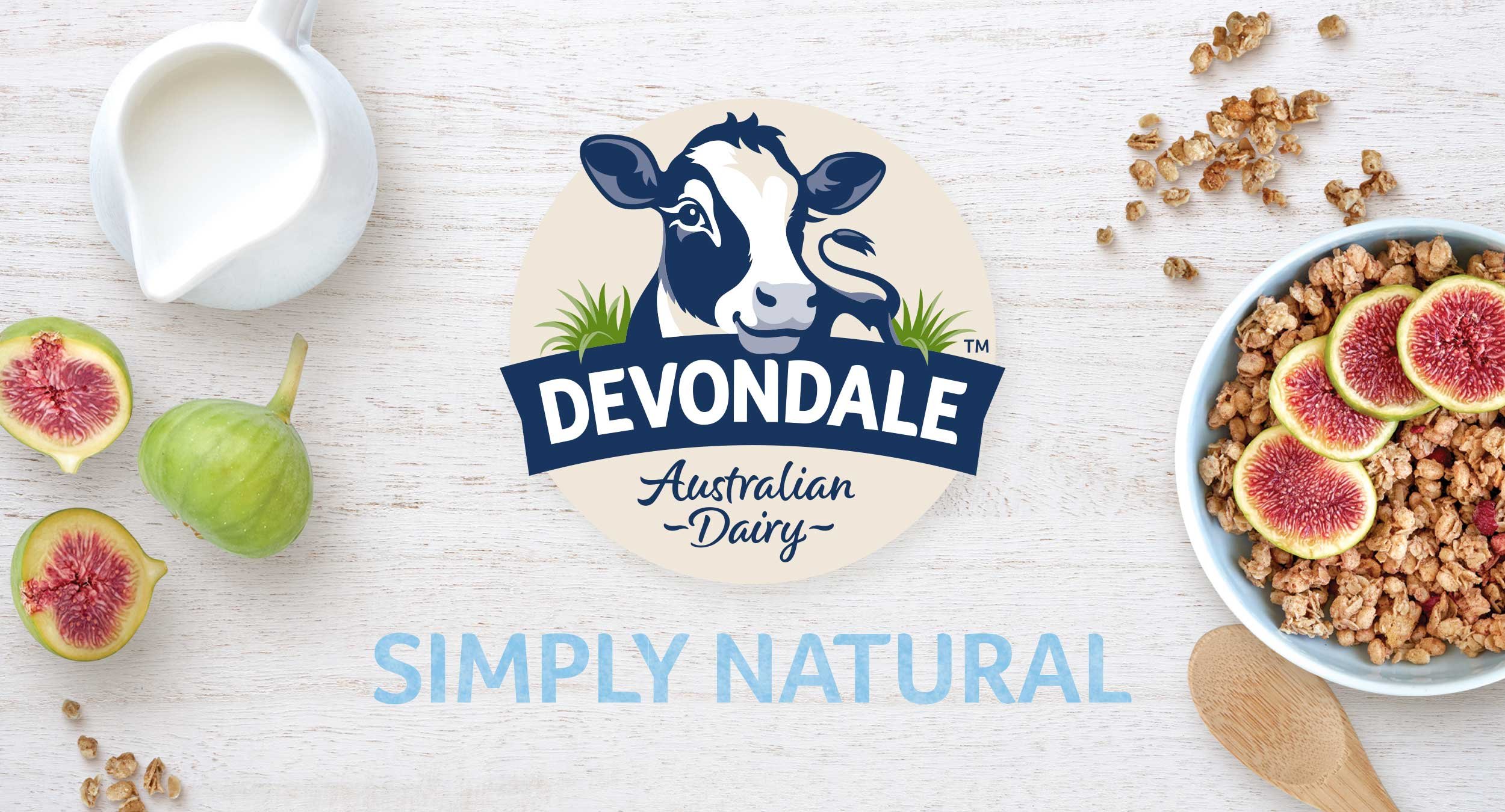
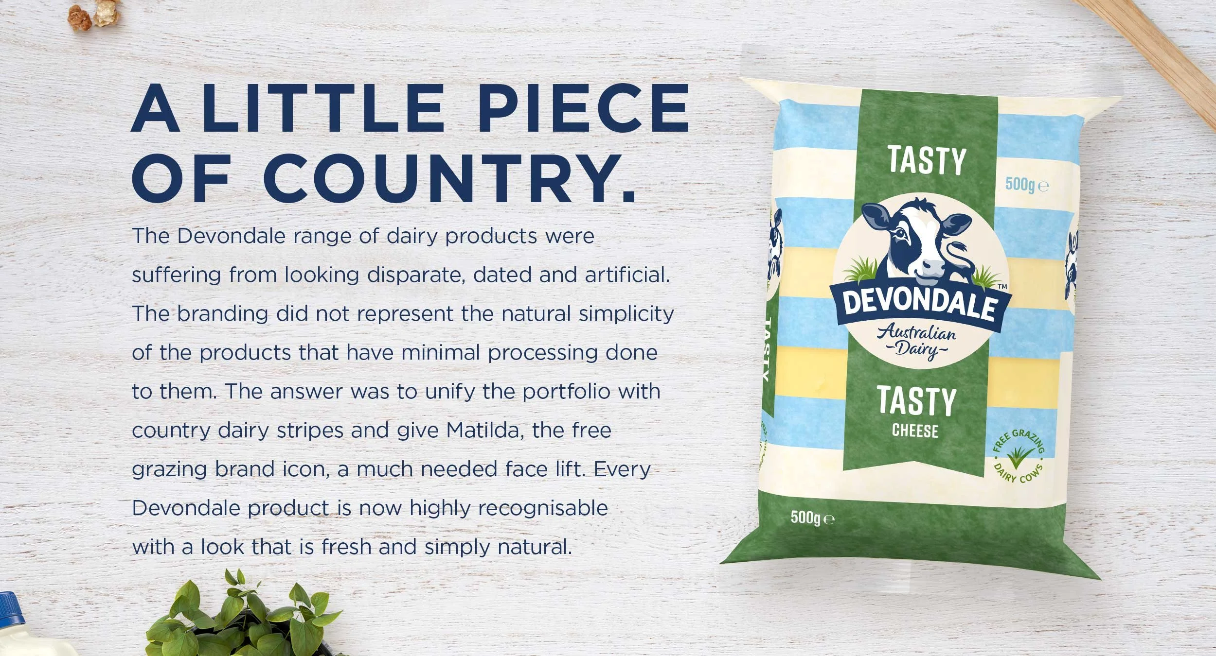
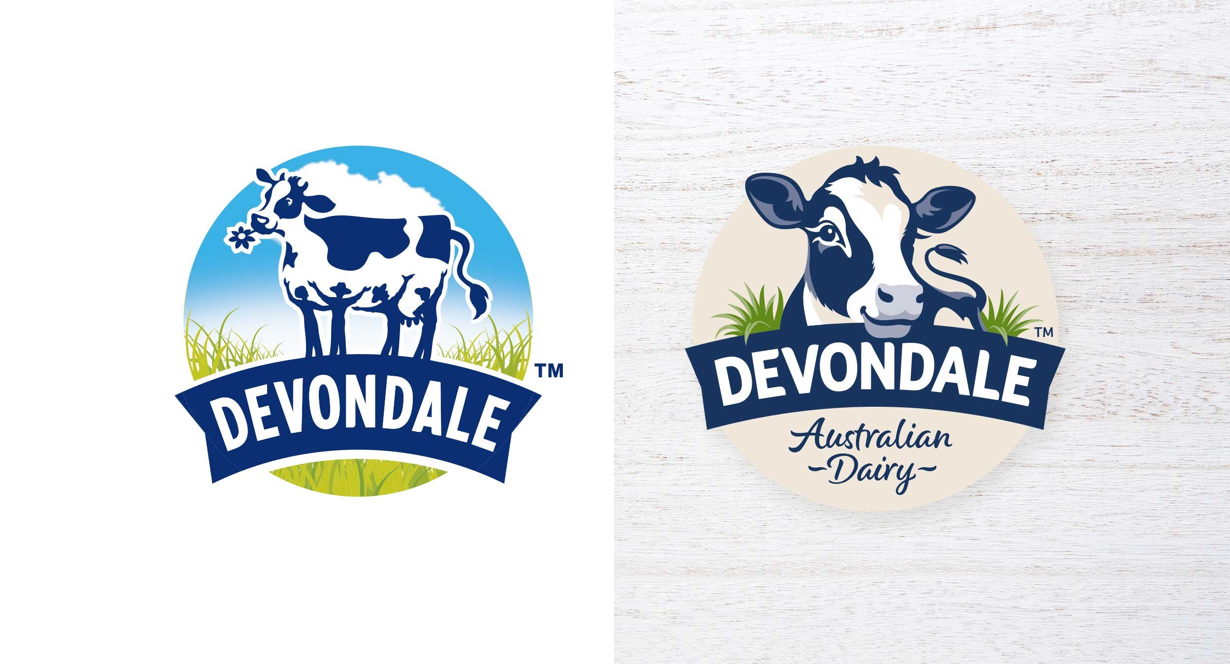
The Devondale range of dairy products were suffering from looking disparate, dated and artificial. The branding did not represent the natural simplicity of the products that have minimal processing done to them. The answer was to unify the portfolio with country dairy stripes and give Matilda, the free grazing brand icon, a much needed facelift. Every Devondale product is now highly recognisable with a look that is fresh and simply natural.
BRAND CAMPAIGN • VISUAL IDENTITY • BRAND ARCHITECTURE • BRAND GUIDELINES • DIGITAL CAMPAIGN • PACKAGING
DISTINCTIVE
BRAND
ASSETS
Simply Natural Dairy gets a fresh new look. An extensive awareness campaign across social media, digital advertising and even an on-pack teaser sticker alerted consumers to the new distinctive brand assets that would unite the ranges. The campaign was dual pronged with one stream featuring heavily the new logo and dairy stripes and the other including more appetite appeal set at the country kitchen table. Both carried the simple message of “Fresh New Look, Same Great Taste” in saturated repetition.