
REFRESH THE
WORLD OVER
Global Alignment
Visual Identity
Distinctive Brand Assets
Packaging Design Suite
THE Insight
IcyPole® has a long history in Australia and has a special place in our hearts. The term "icy pole" entered Australian vernacular in the 1930s via Peters Ice Cream (founded by American Fred Peters in 1907). It became a ubiquitous, generic term for any water-based frozen confection on a stick.
THE VISION
Following the acquisition of Peters Ice Cream by Froneri, the global ice cream giant sought to gain efficiencies by implementing tried and tested brand strategies across their entire portfolio. Water ice refreshment is the latest category to benefit from the global principles of Froneri.
THE IDEA
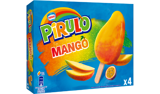
The idea was to harness the power of global to rekindle the love of local. Our IcyPole® remains a staple in most Australian homes so we were very cautious in not throwing out the baby with the bath water. The trick was to adopt the strengths of the global approach without losing the recognition and the ‘soul’ of our beloved IcyPole®.
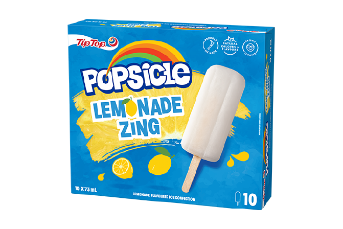
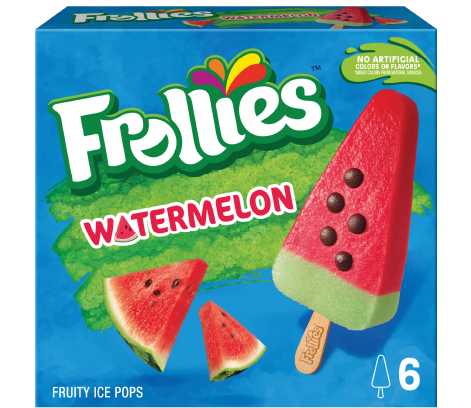
ONE OF US!
ONE OF US!
GLOBAL CONTEXT
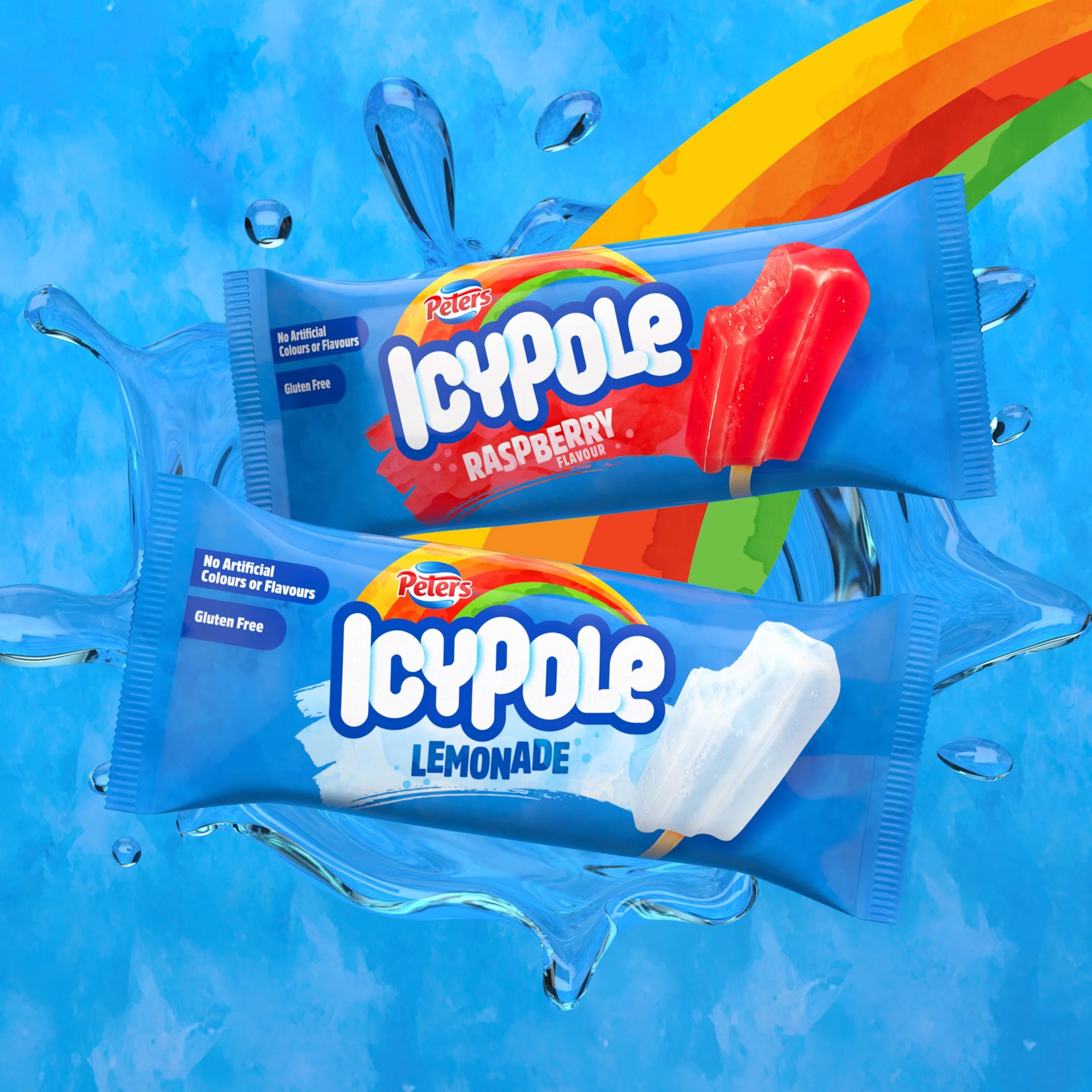
In every market that they operate in, Froneri has a strong presence in water ice refreshment. All markets employ a watery-blue background for range blocking that defines a destination in the freezer for water ice refreshment. Luckily, so did IcyPole® which made the transition from 90’s glowing blends to a watercolour, painterly finish seamless.
The other graphic attributes that were applied to the local brands were containing the brand in bold keylines for projection off the blue and the addition of a rainbow of colours to add the idea of joy in the products beyond the function of a delicious cool-down. This is supported by a paintbrush ‘swoosh’ of flavour delivered by the product itself. These visual attributes were noticeably missing from IcyPole®.


LOCAL REFRESH,
GLOBAL RAINBOW
THE IDEA
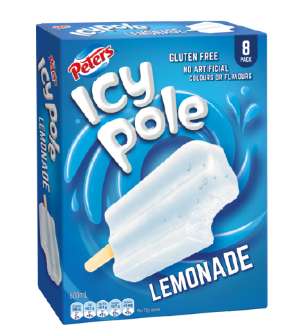
The previous branding was not doing itself any favours in breaking the ‘generic term’ perception and was quickly losing relevance in today’s competitive market. The function of water ice refreshment was not ownable, water splashes were not appealing and IcyPole® was running the risk of following in the footsteps of category generic brands like Biro and Electrolux all the way to their grave.
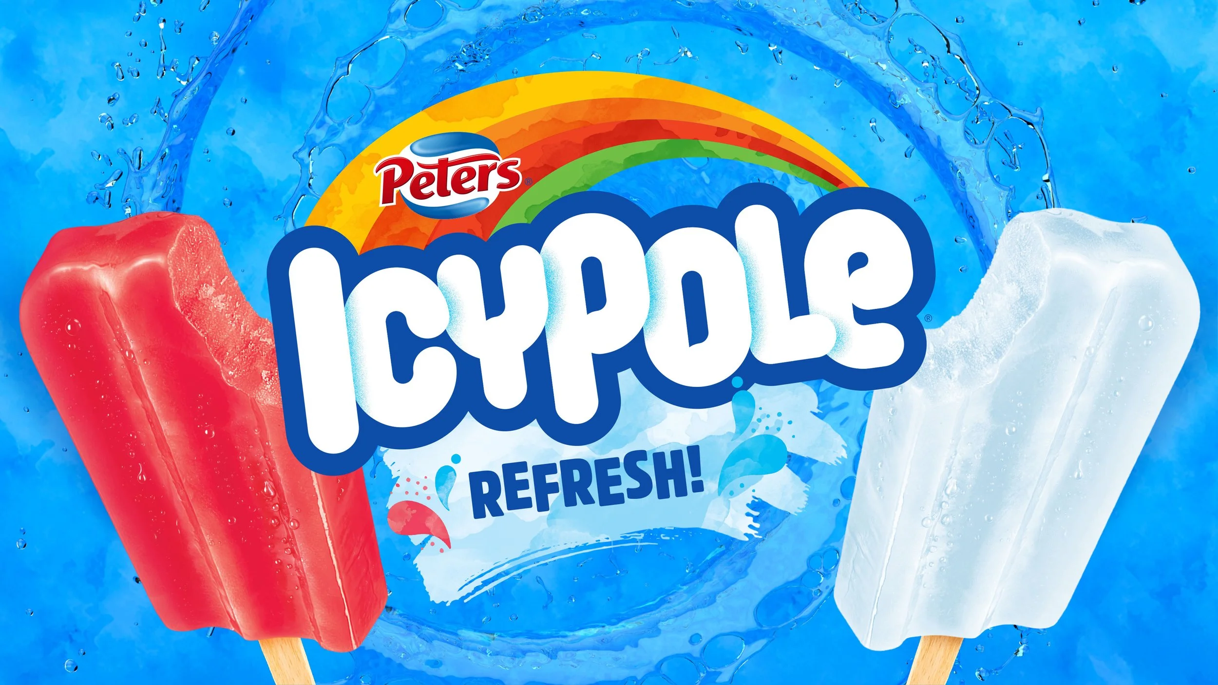
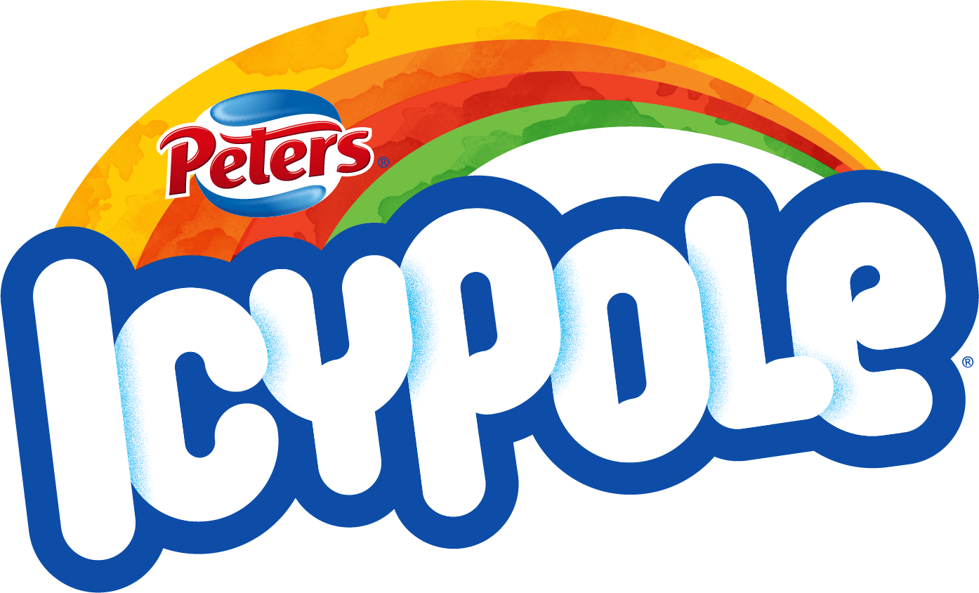
Time for a refresh! (pun intended) Bespoke typography was crafted based on the ‘Pole’ part of the brand which was the stick. Condensed letterforms were created and overlapped with icy shadows to get the brandmark on one line to allow for power-branding. The overall rounded finish gave the brand an approachable friendliness, complete with a little gift and a nod to the past with the splash and smiling ‘e’.
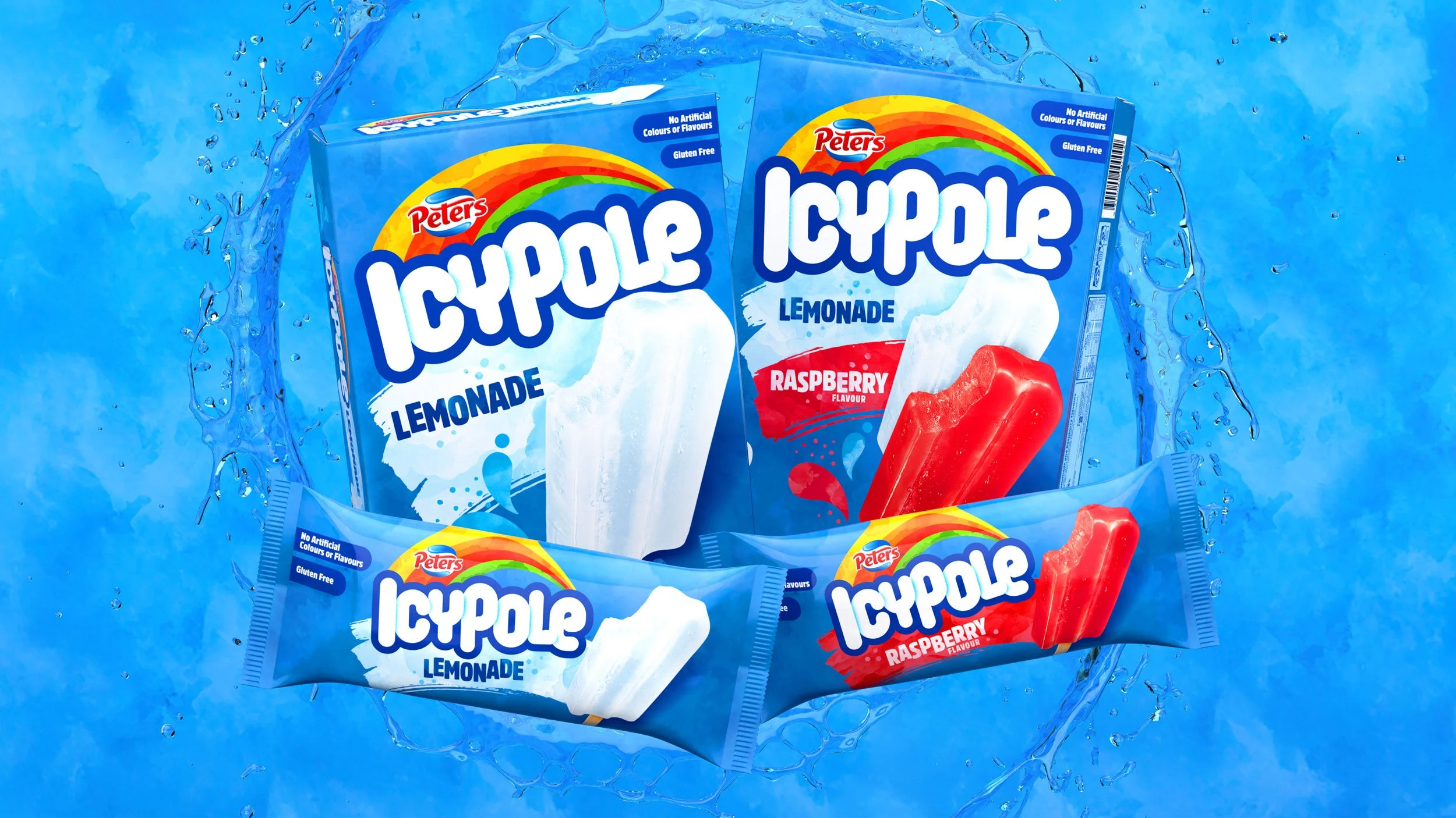
The global rainbow was adopted but with the watercolour treatment to have synergies with the background. A bold, dark blue outer keyline projects the brand off pack.
A BREATH OF
REFRESH AIR
RETAIL IMPACT
The new visual identity for IcyPole® has given Peters a reset with one of their cornerstone brands. This gives them another weapon at their disposal - another modern, refreshed weapon.
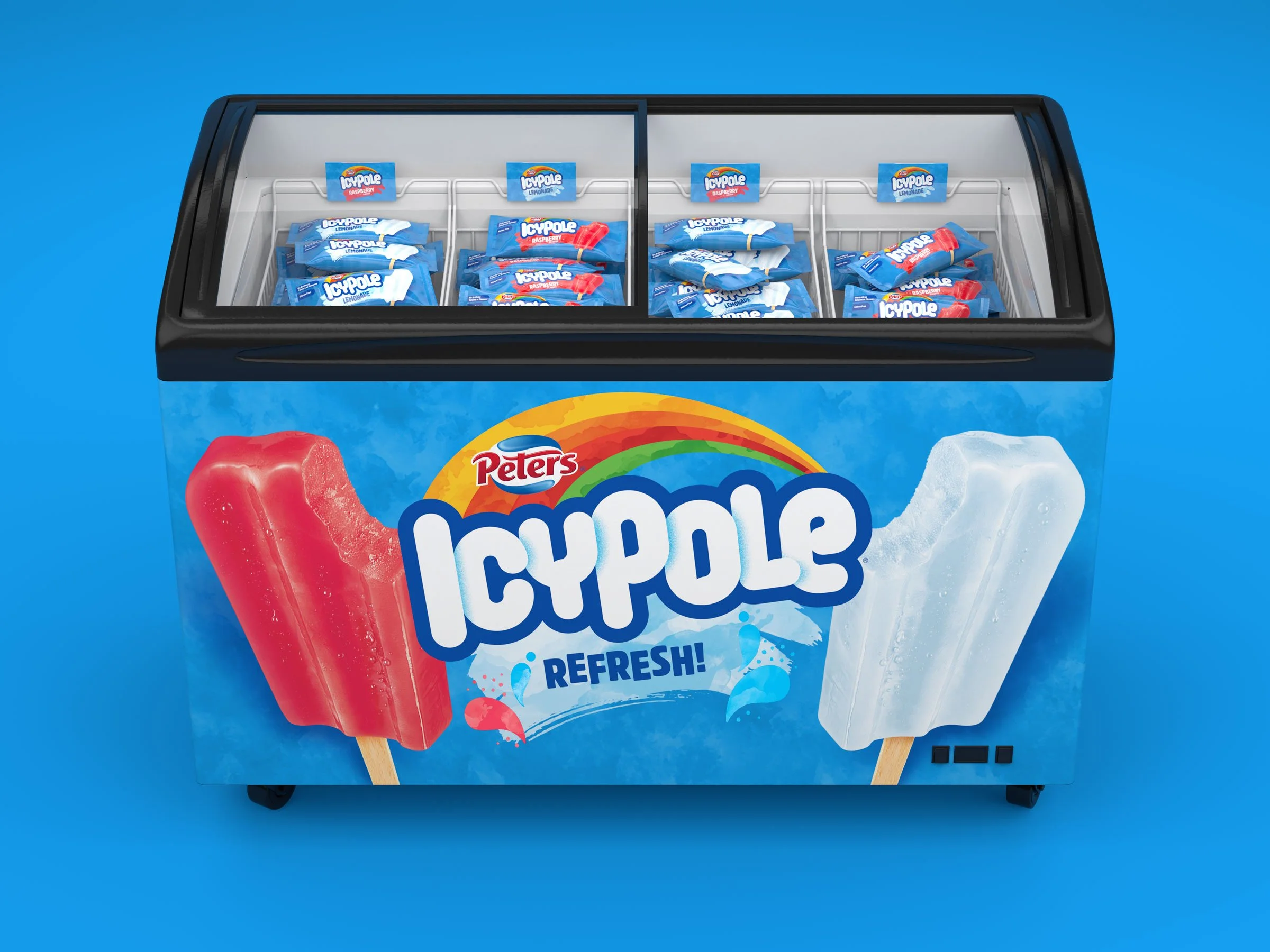
Blue watercolour beacons with the joy of rainbow colours create a destination for refreshment in retail environments. A classic product refreshed for today.
MAKING A
SPLASH!

The refreshed visual identity for IcyPole® has turned the brand around, giving it strength in numbers on a global scale. The brand personality has opened up the appeal to be beyond kids and allowed for all generations to enjoy the upside of the cool-down.
The refreshment beacon that IcyPole® creates in retail is visually arresting and transcends beyond functional refreshment to promise happy enjoyment. The rainbow brand asset projects off the refreshing blue and the bespoke logotype based on the product truth commands attention. No longer a category generic - IcyPole® has returned back to icon status.