
BUILDING
BLOCKS
FOR LIFE
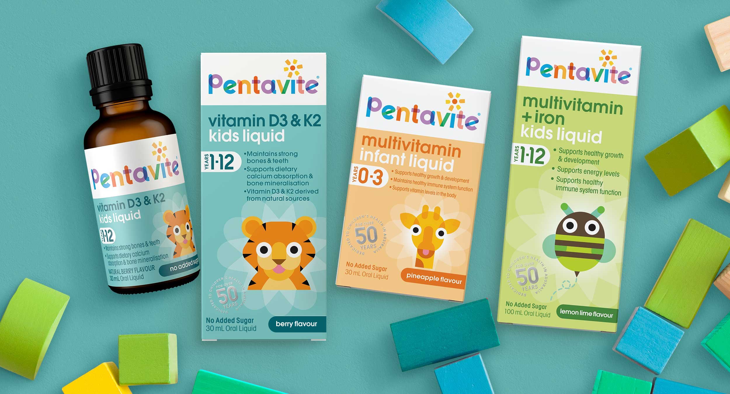
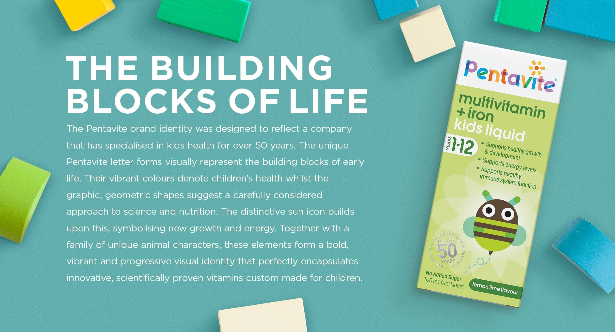
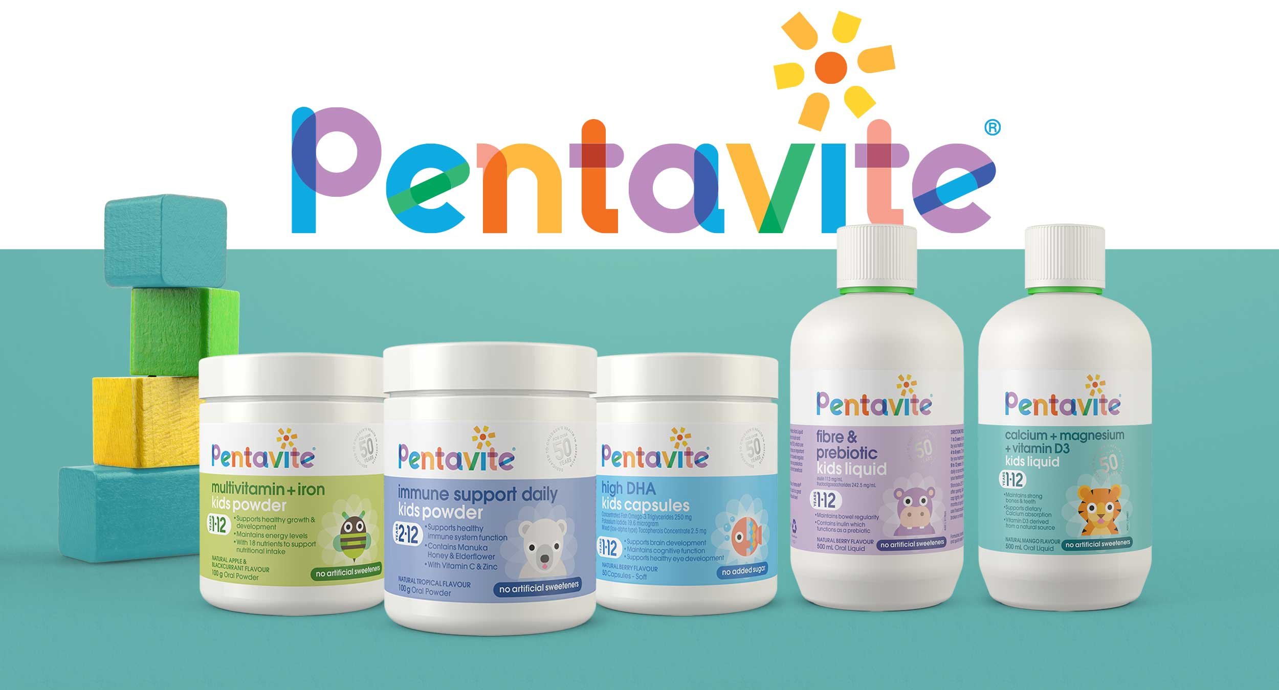
The Pentavite brand identity was designed to reflect a company that has specialised in kids health for over 50 years. The unique Pentavite letter forms visually represent the building blocks of early life. Their vibrant colours denote children’s health whilst the graphic, geometric shapes suggest a carefully considered approach to science and nutrition. The distinctive sun icon builds upon this, symbolising new growth and energy. Together with a family of unique animal characters, these elements form a bold, vibrant and progressive visual identity that perfectly encapsulates innovative, scientifically proven vitamins custom made for children.
BRAND ARCHITECTURE • BRAND IDENTITY • BRAND CAMPAIGN • PACKAGING