A friendly new
face in town
Brand Positioning
Brand Narrative
Brand Identity
Brand Collateral
Brand Guidelines
Insight
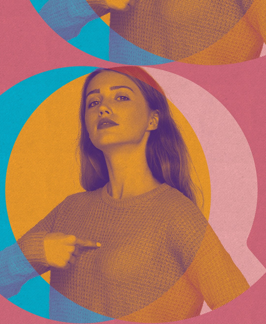
61% of young people (sampled) have heard of Kids Help Line and checked them out before. Young adults (teenagers), however, perceived the service being for those younger than them and don’t identify as ‘kids’. KHL needed to dial down the ‘kiddy-ness’ while maintaining a youthful energy and open up the brand to a wider audience.
Vision
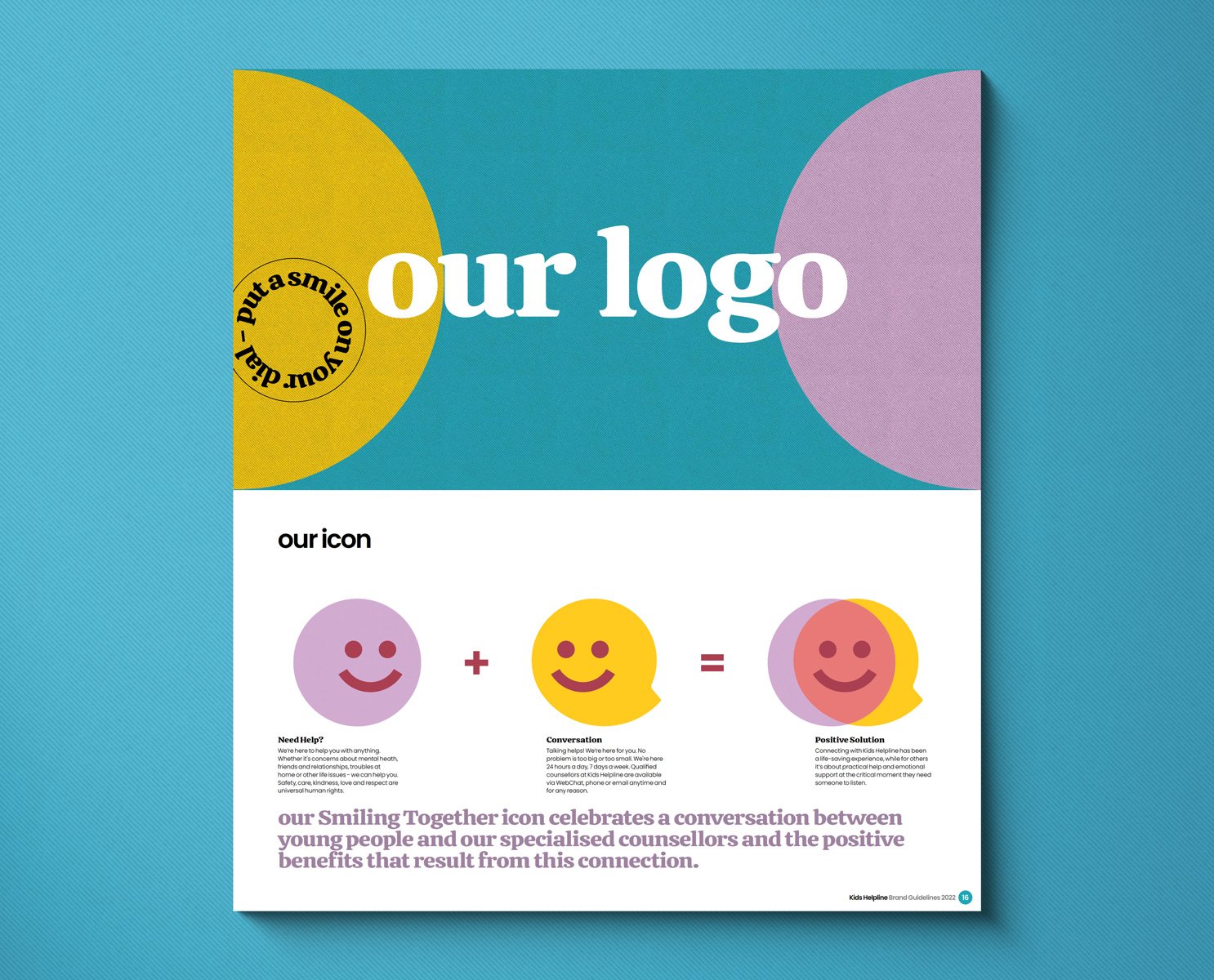
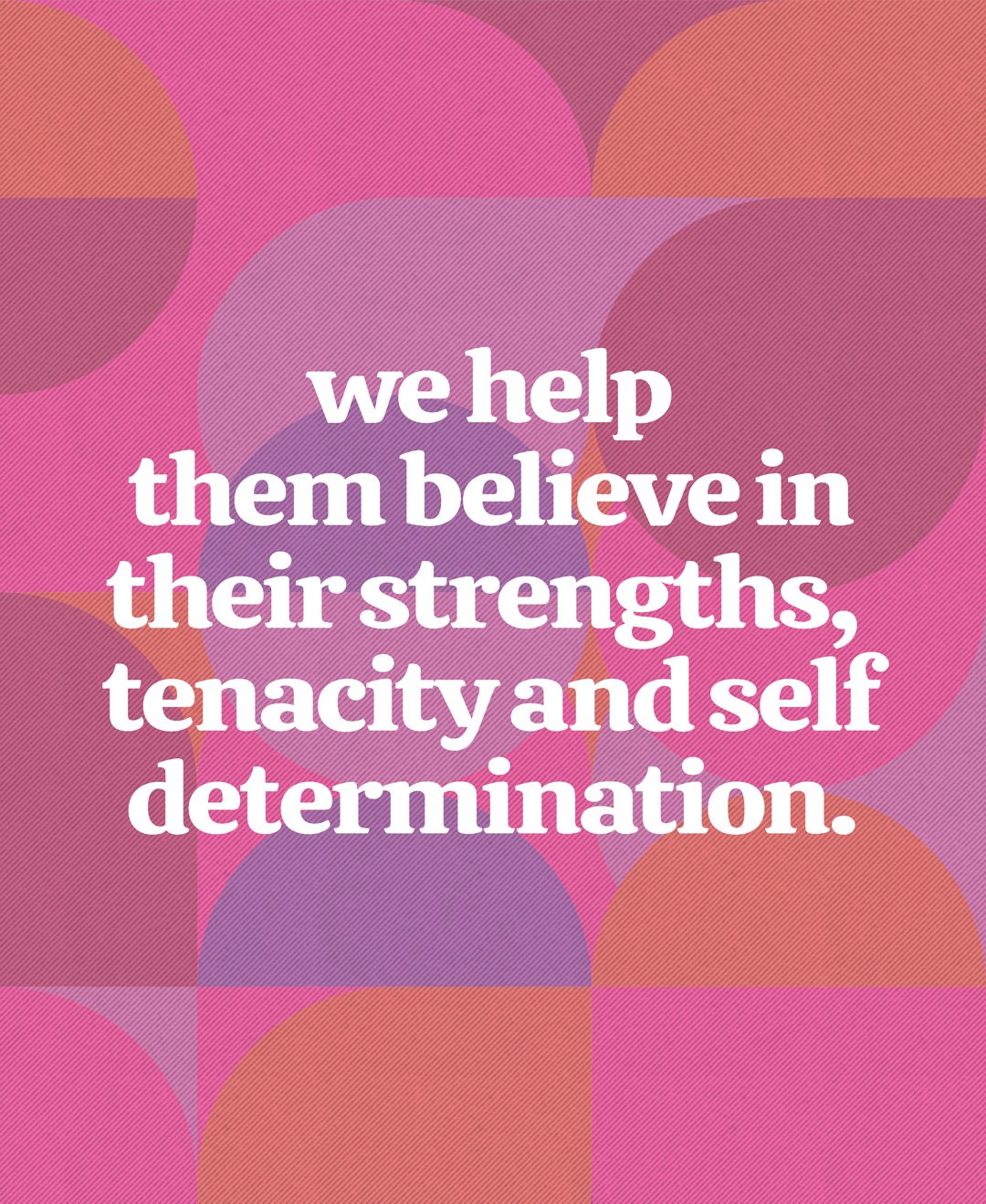
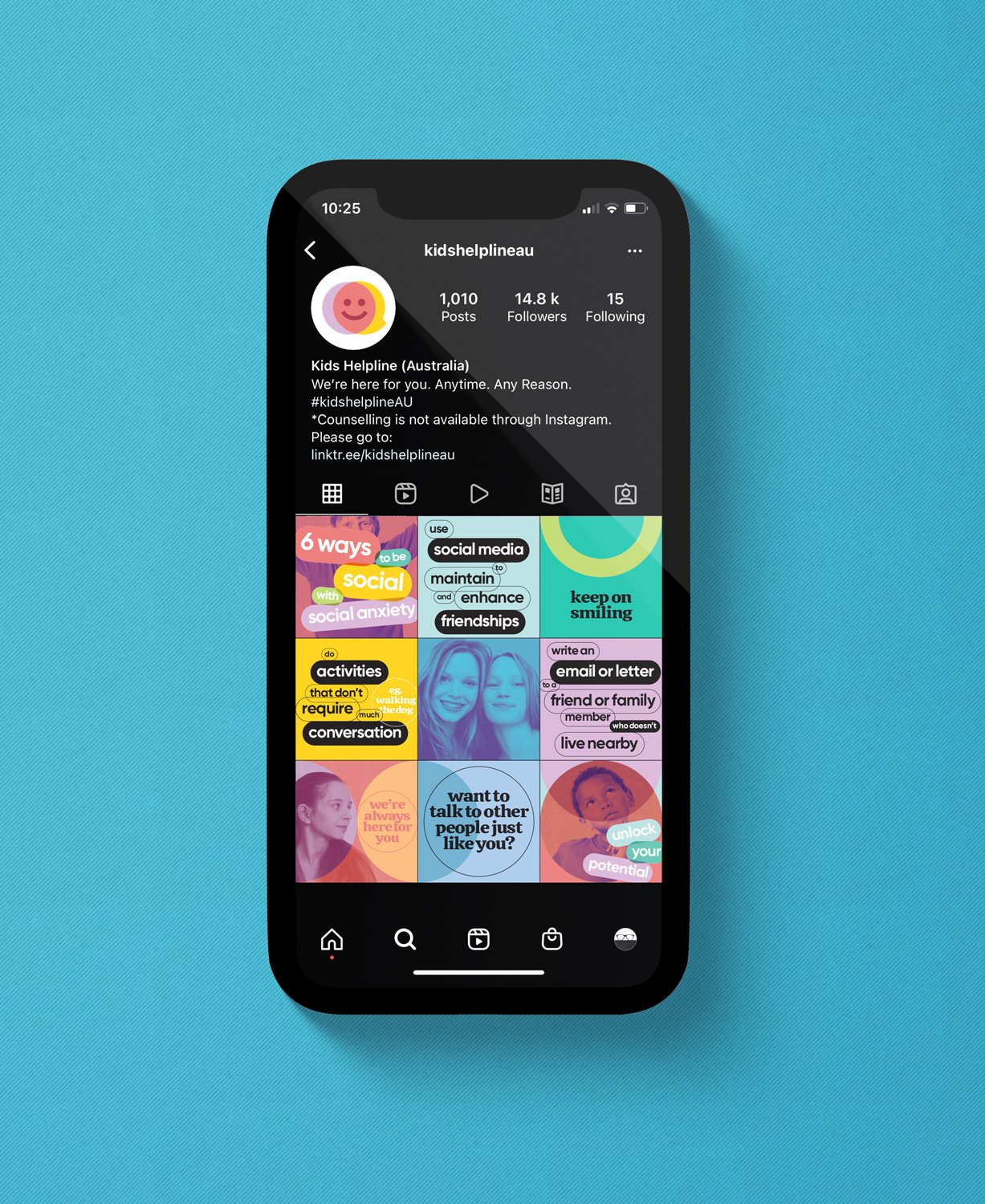
Introducing the fresh new face of Kids Help Line. One that exudes optimism and positivity with an approachable and welcoming persona. It ensures a recognisable identity that resonates with the community and inspires hope and opportunity. It is a stamp of pride, reflecting support, mutual respect, compassion and collaboration. Acting as a key point of brand recognition, the service is a beacon of hope for young people in times of need. The ‘Smiling Together’ icon celebrates a conversation between young people and the specialised counsellors of Kids Help Line. The combination reflects the positive benefits that result from this connection.
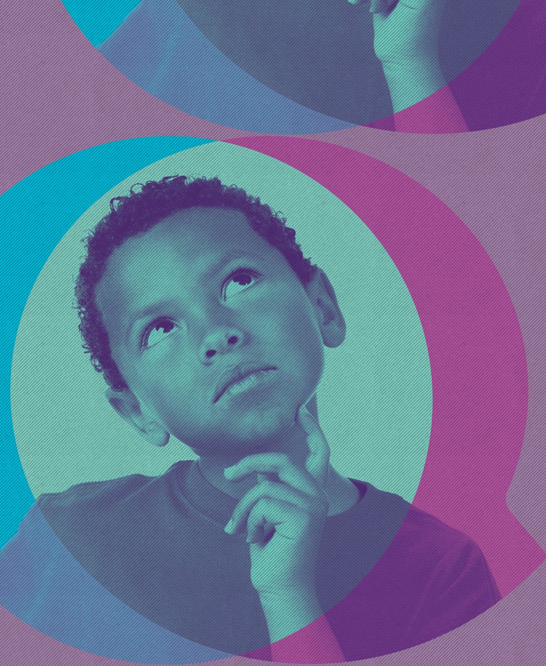
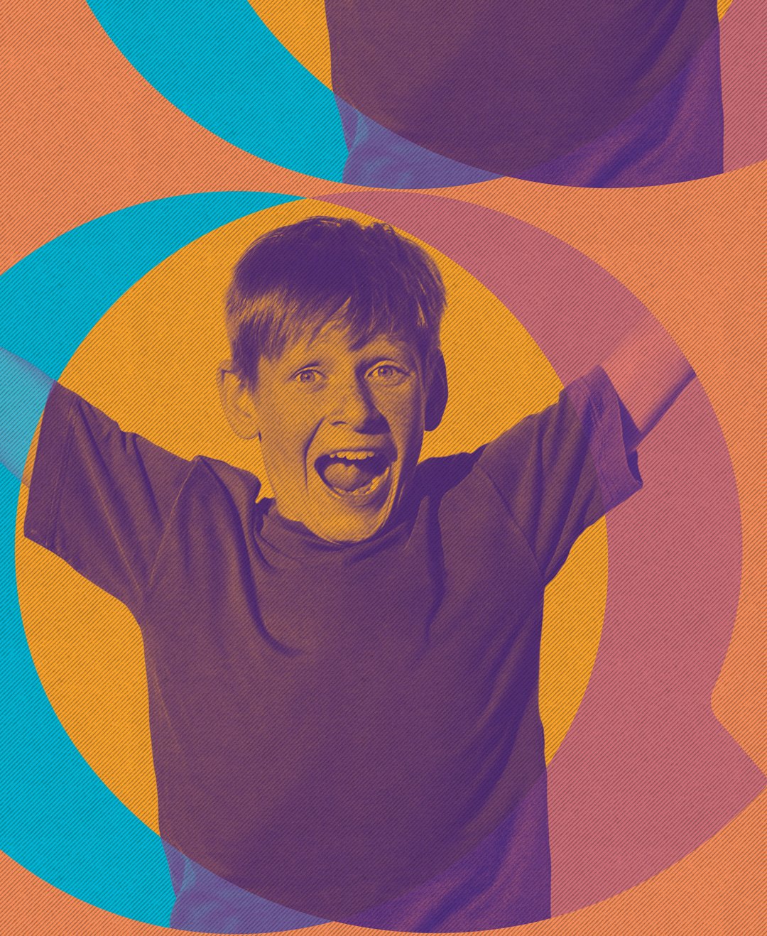
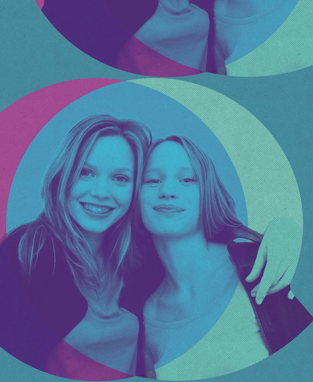
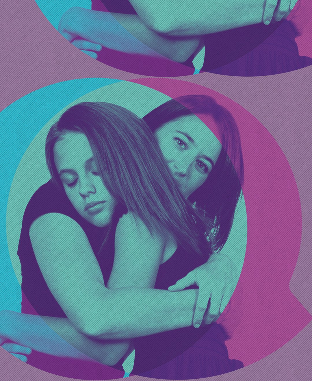
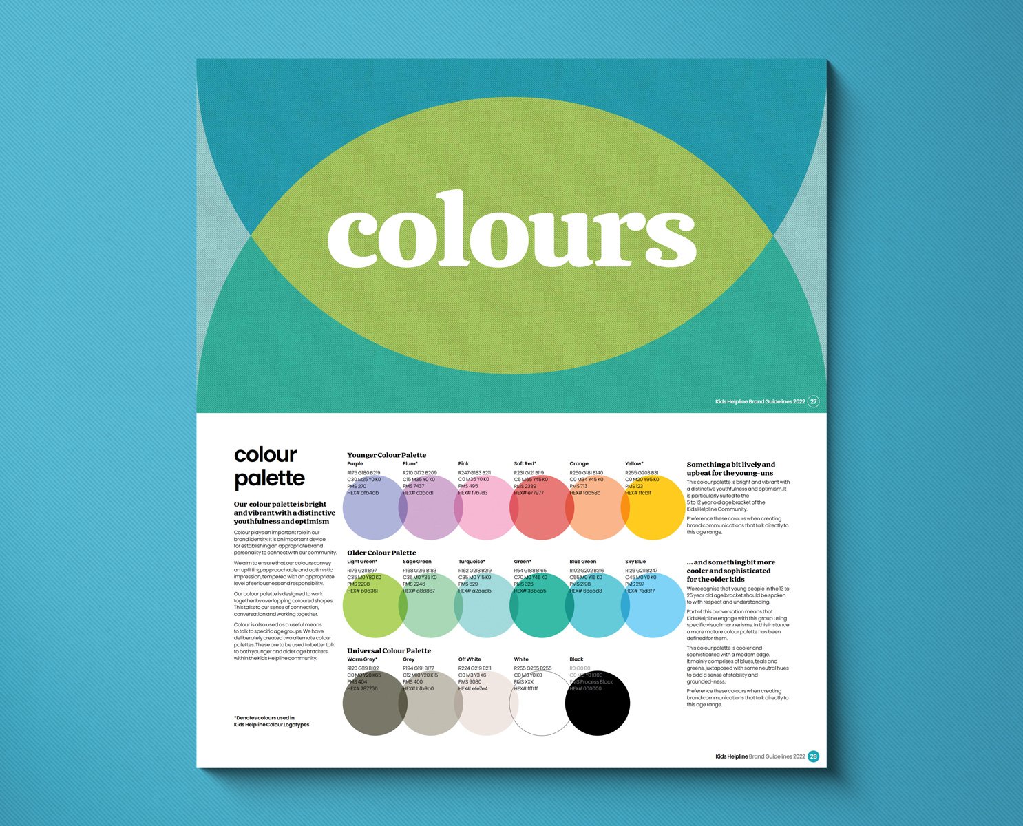
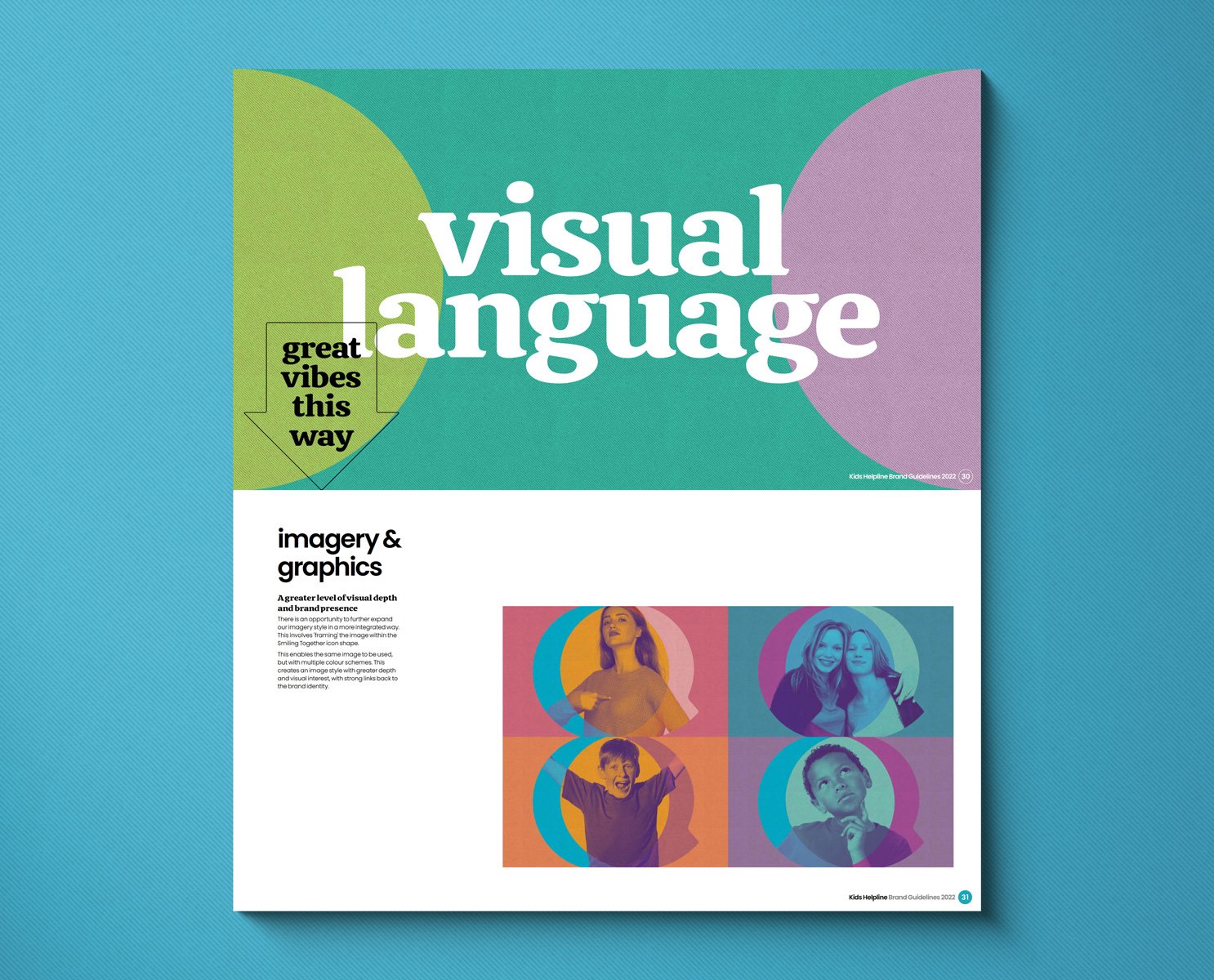
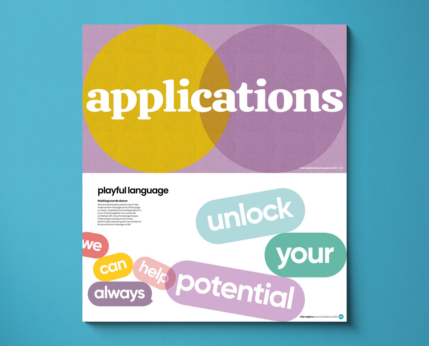
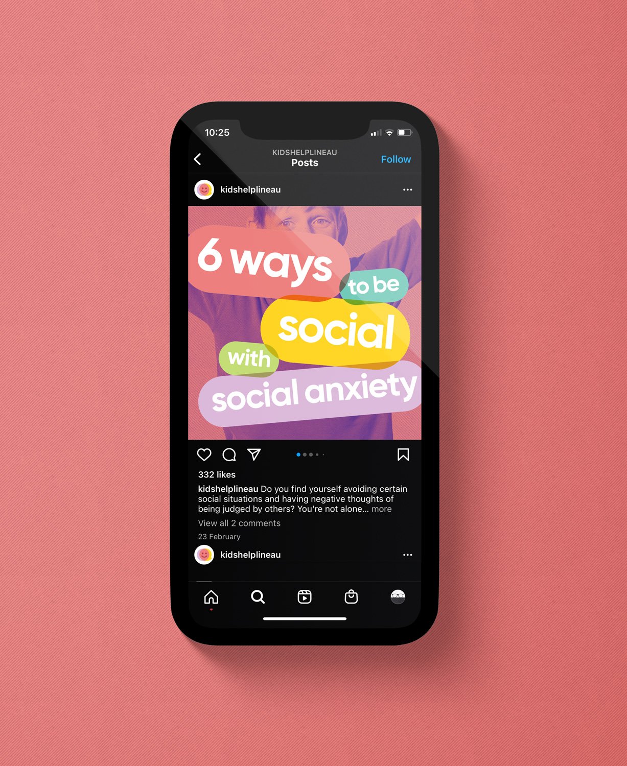
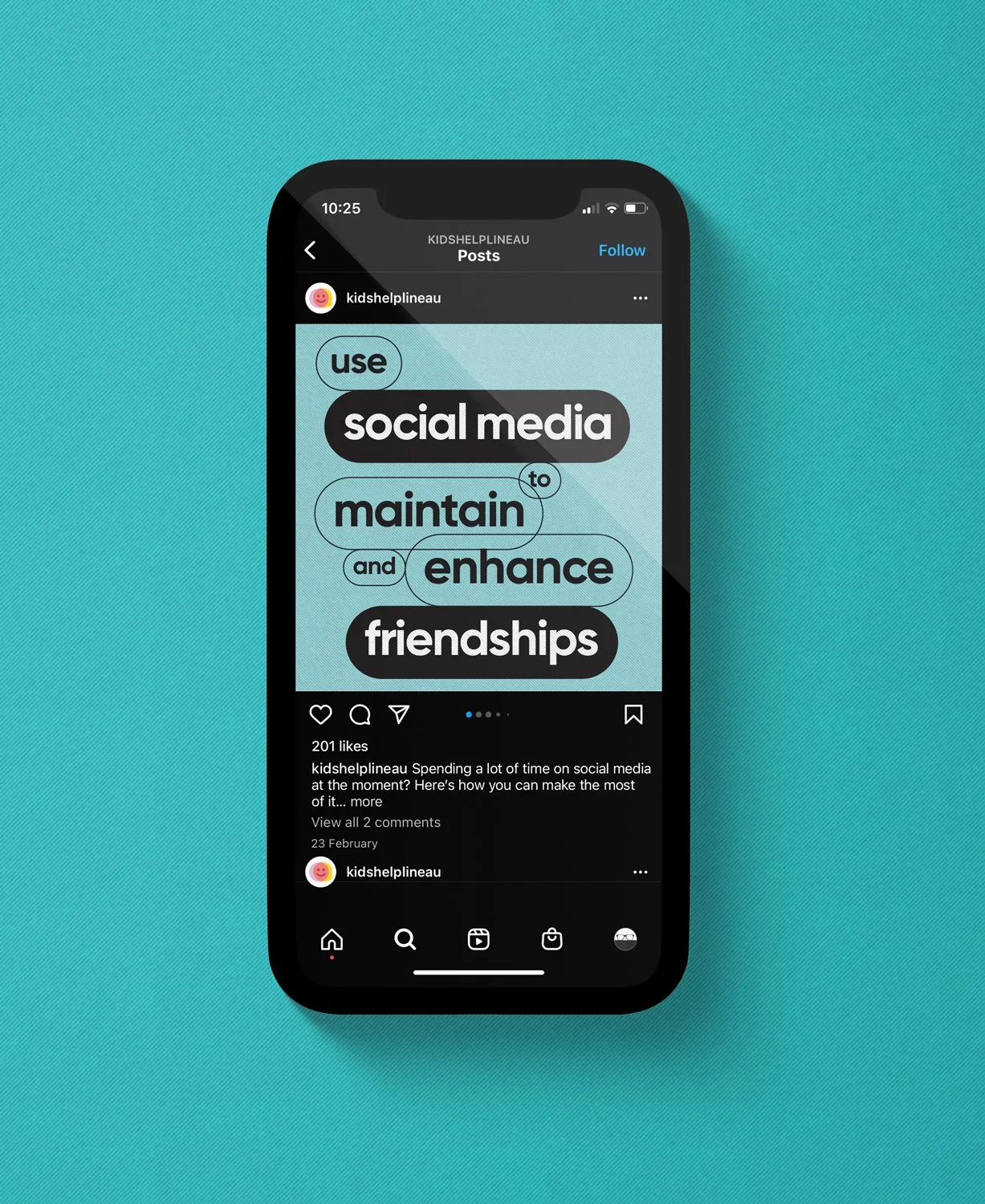
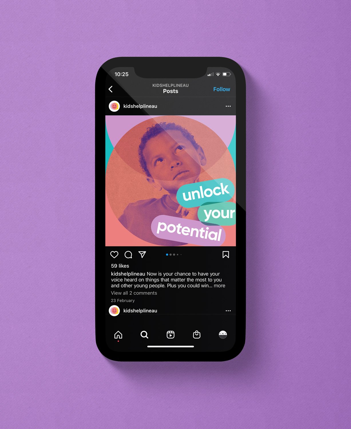
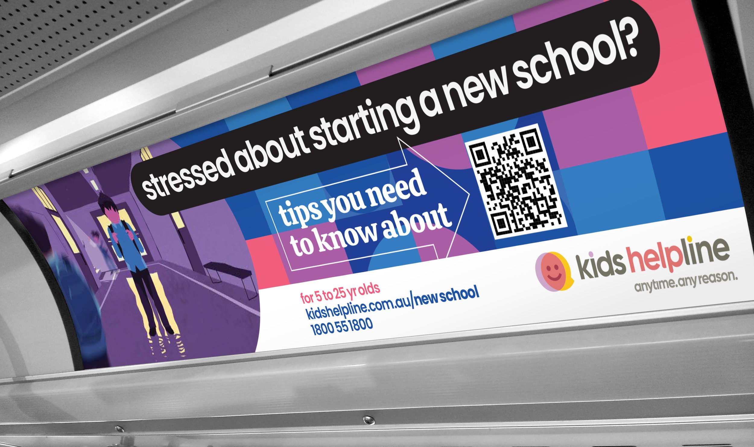
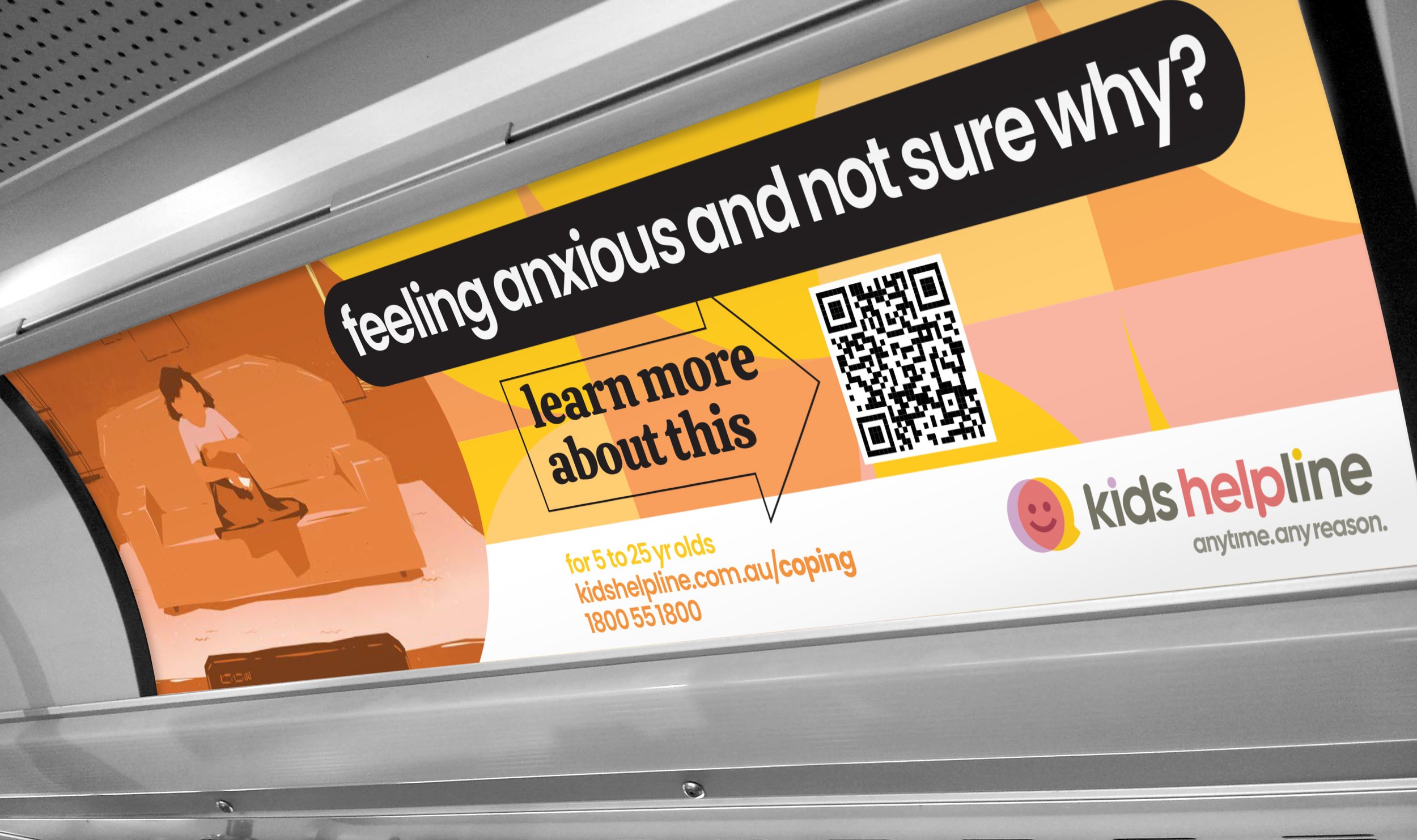
The brand identity created possesses great visual depth. It is the sum total of many different parts. As well as the logo, there are several visual elements that are used to communicate a distinctive identity and unique personality. Assets range from a bold photographic style, graphic illustrations and a youthful approach to language. They are created to be versatile and appropriate for all applications.


Brand guidance that leaves nothing to chance.