

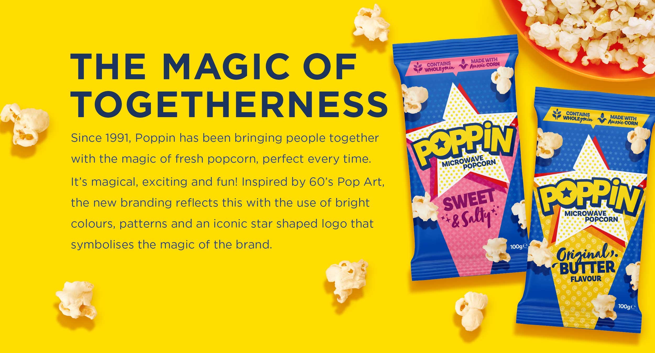

THE MAGIC OF
TOGETHERNESS
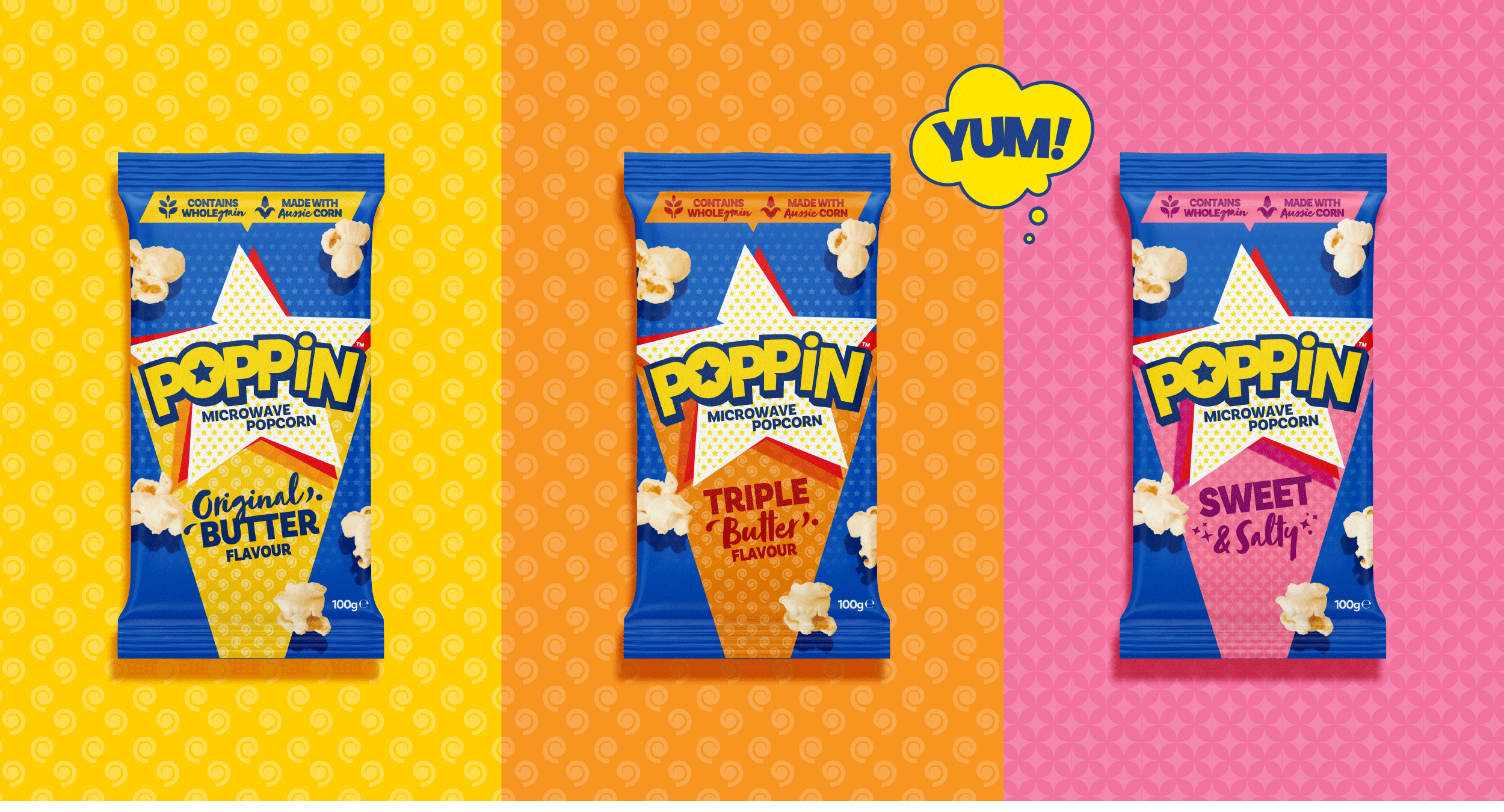
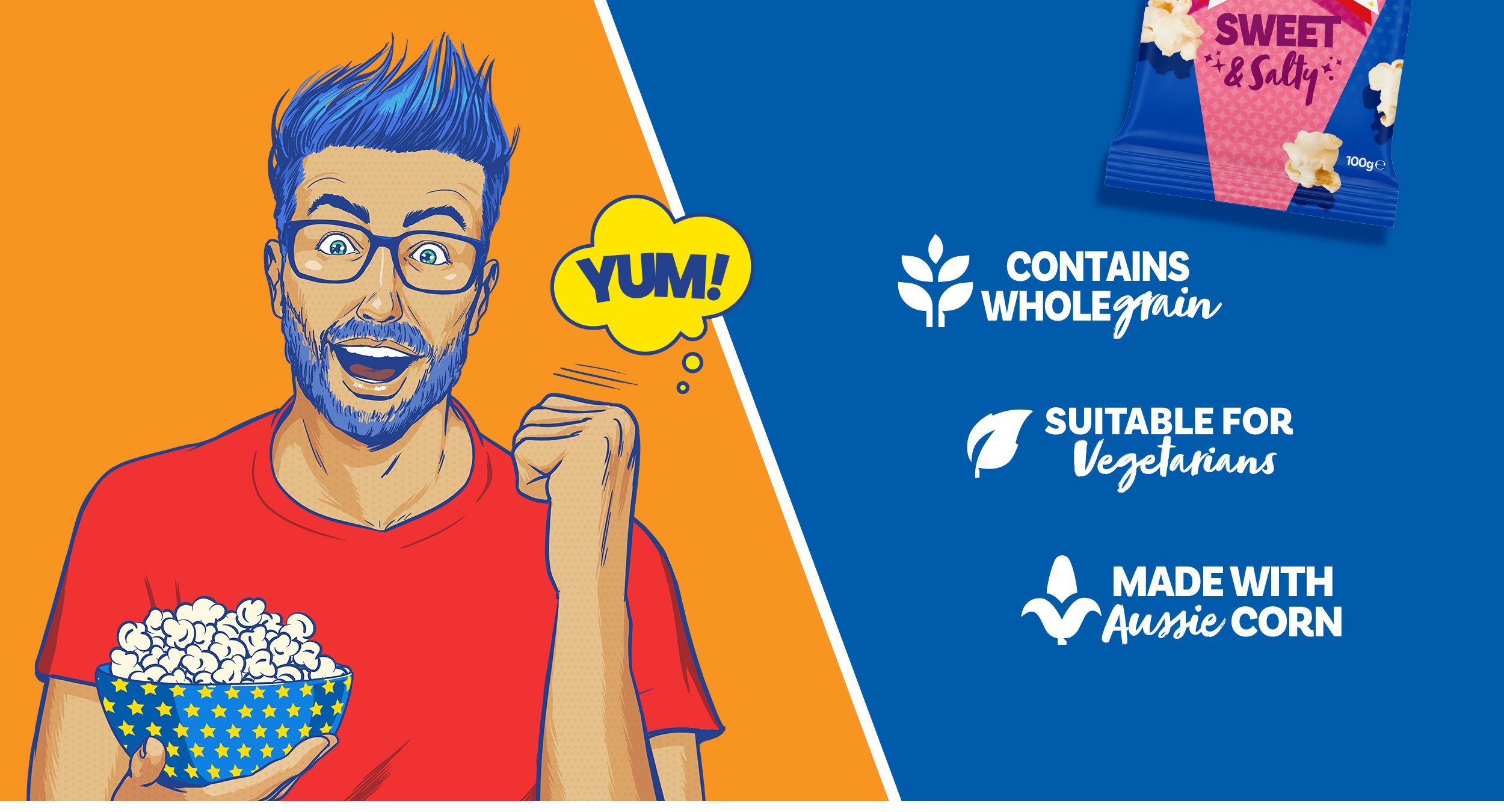
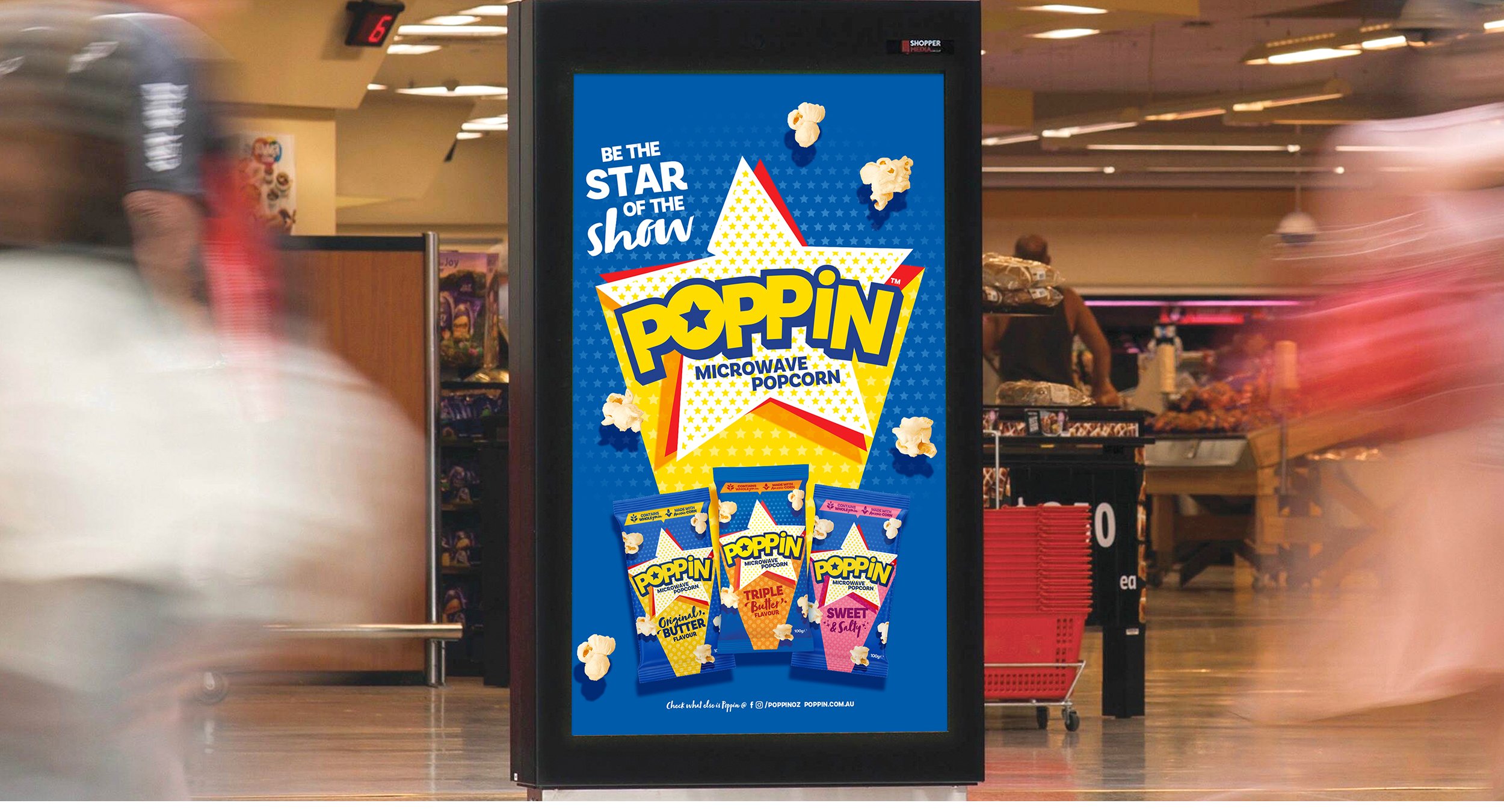
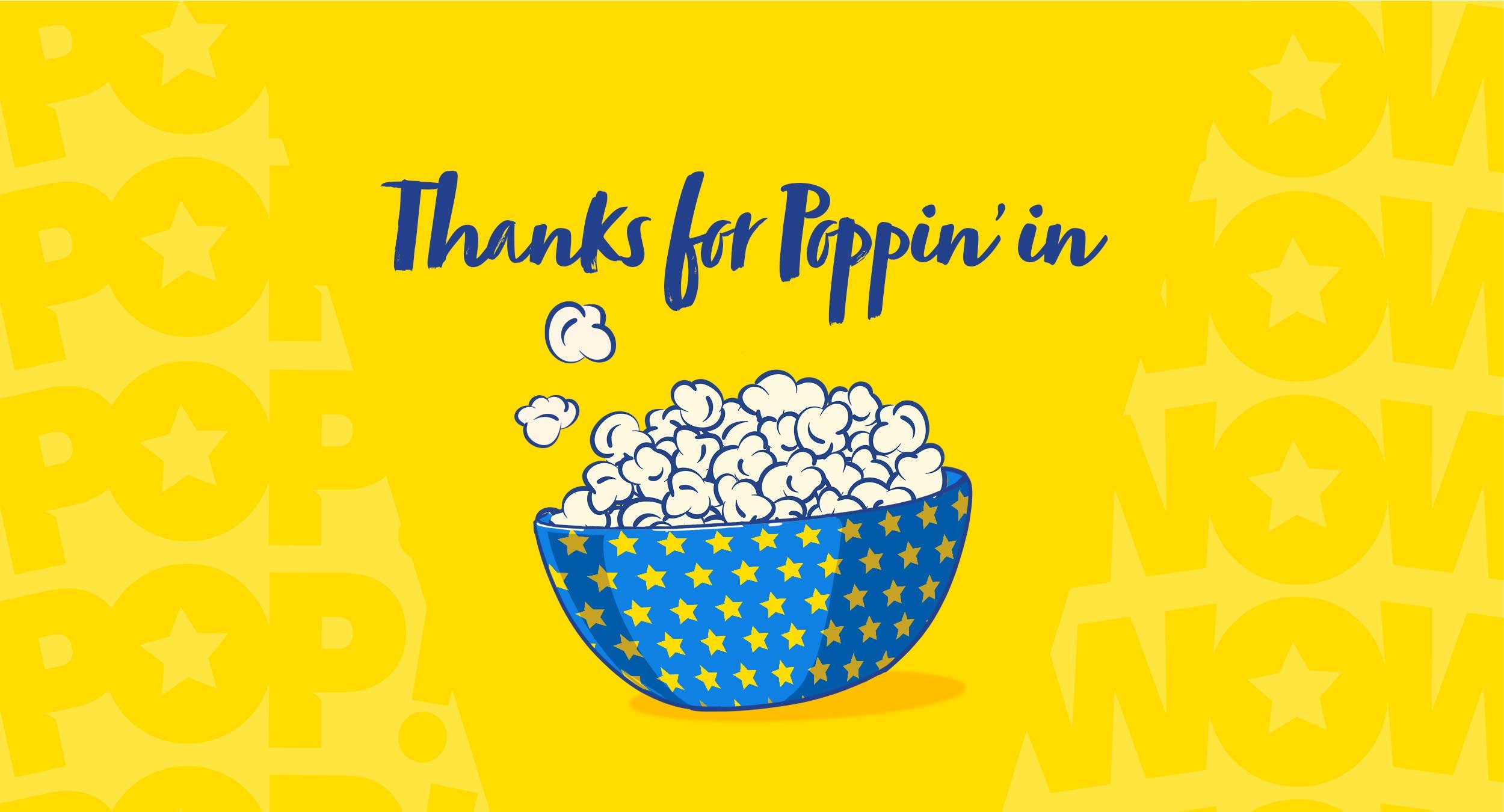
Since 1991, Poppin has been bringing people together with the magic of fresh popcorn, perfect every time. It’s magical, exciting and fun! Inspired by 60’s Pop Art, the new branding reflects this with the use of bright colours, patterns and an iconic star shaped logo that symbolises the magic of this much loved brand.
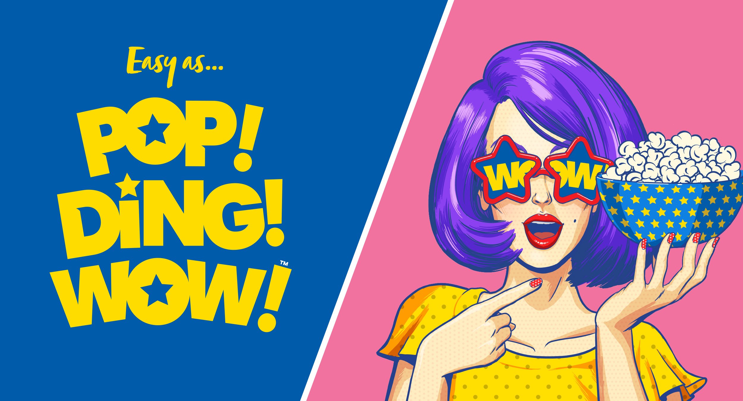
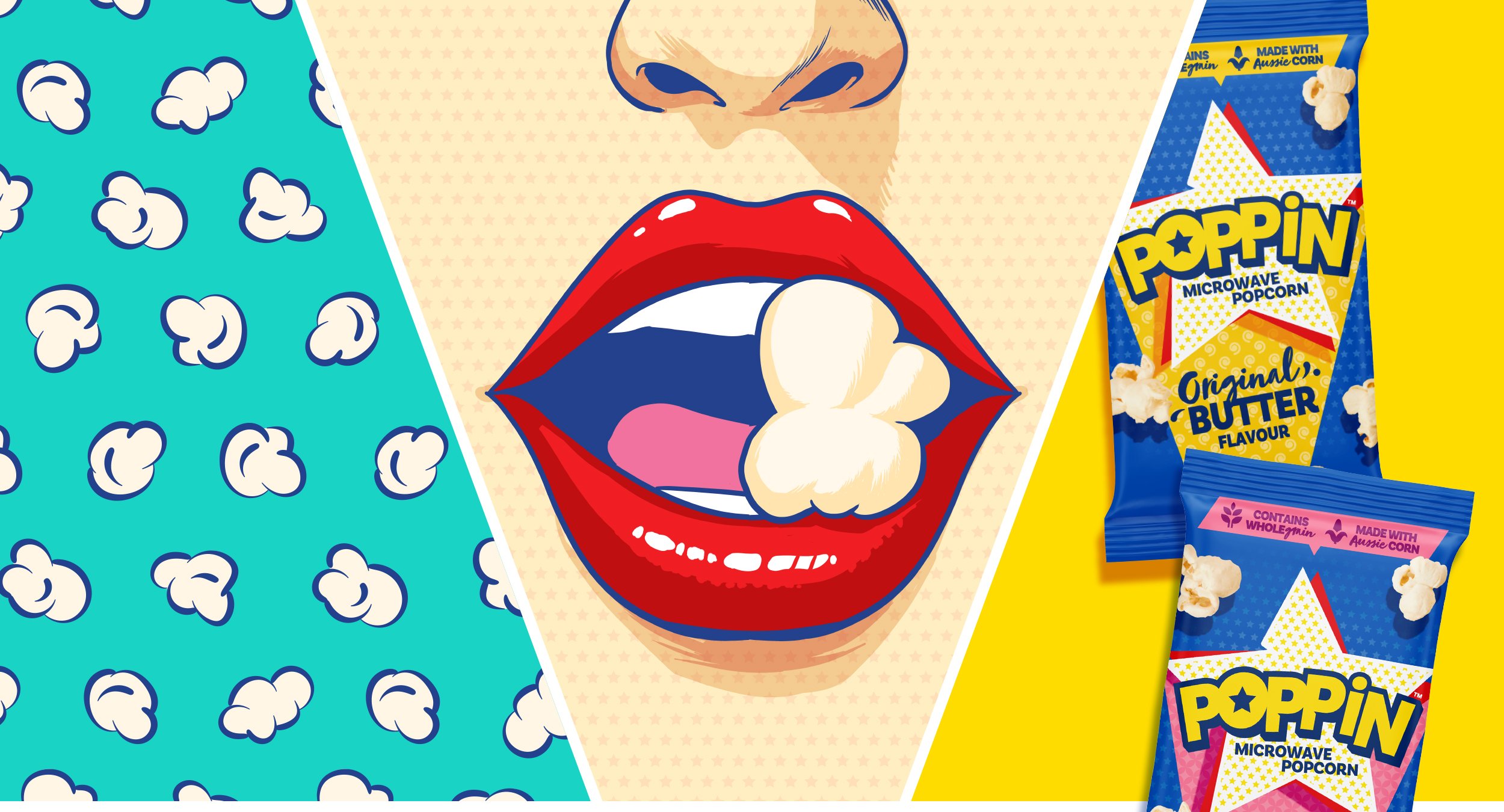
Creating the whole Poppin family of Poppy, Parker and Preston gave the brand depth and together with the comic-book storytelling, Poppin now has a wealth of brand assets at its disposal. This was brought to life in TheKey directed advertising and promotion that promises to transform boring occasions into ones filled with fun and flavour. Pretty soon everyone will be joining in the magic ritual of POP! DING! WOW!
VISUAL IDENTITY • BRAND CAMPAIGN • PACKAGING • POINT OF SALE