
Insight
The Peter Lehmann Portrait range was losing relevance with consumers and the ability to entice in a category now much more modern & competitive. Staying true to Peter’s original vision of a range that ‘painted a picture’ of the Barossa region he loved, we were tasked with realising this in a way that would engage todays consumers.
Vision
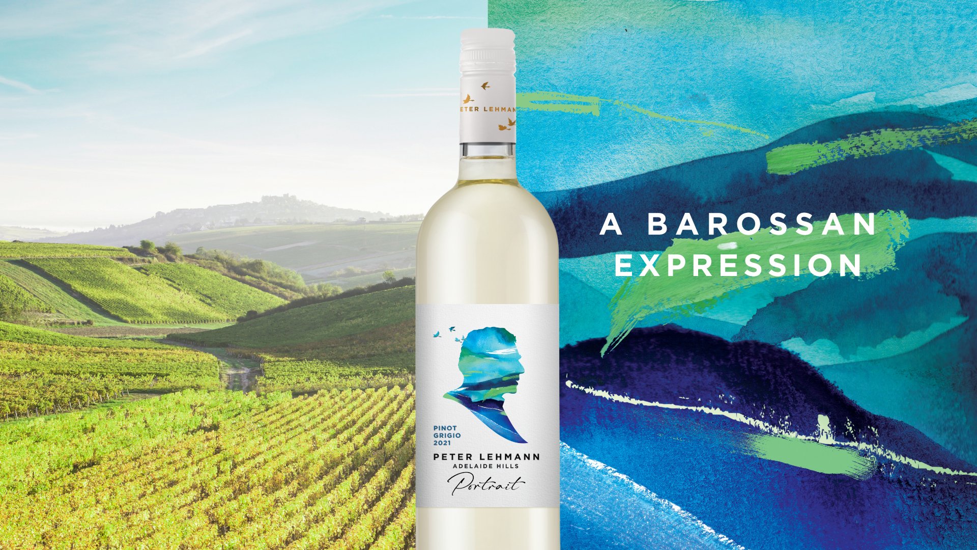
With a vibrant, contemporary illustration approach we capture expressions of the Barossa landscape that reflect each unique varietal with a sense of modernity to allow Peters initial vision to continue. The medium and colour palettes for each varietal were inspired by each varietal unique tasting notes, depth & texture. Bold, textured strokes with rich colour bring to life the depth of our reds. Watercolour washes and crisp colours celebrate our refreshing rosé & whites.
A BAROSSAN EXPRESSION
Illustration
Packaging Design


Experience the Barossa in every sip, with the new Peter Lehmann Portrait range – capturing the beauty of the stunning Barossa landscape through hand-painted expressions, making each label its own work of art.


