SAME BUSHELLS.
MORE BUSHELLS.
Visual Brand World
Distinctive Brand Assets
Packaging Design Suite
Brand Collateral
THE Insight
Mental availability isn't just about recognition - it's about emotion. Bushells has been Australia's everyday cup of tea since 1883. Over 140 years, it earned its place not just on the shelf, but in the home. The brand didn't have an awareness problem. It had an emotional availability problem. And in a category where traditional black tea sales are declining, that gap needed closing.
THE VISION
A refreshed Bushells that connects with consumers more emotionally, as a brand of today, without forgetting it's a brand of 140 years. Same logo, same iconic blue, same trusty teacups all brought together with greater care, clarity and confidence than ever before.
THE IDEA
We didn't invent anything new, we helped people reconnect with what they already loved. Because that's the quiet magic of great brand evolution. Familiarity plus feeling. The kind that makes someone reach for you instinctively, almost emotionally.
From Legacy
to Leading
Rebuilt for relevance
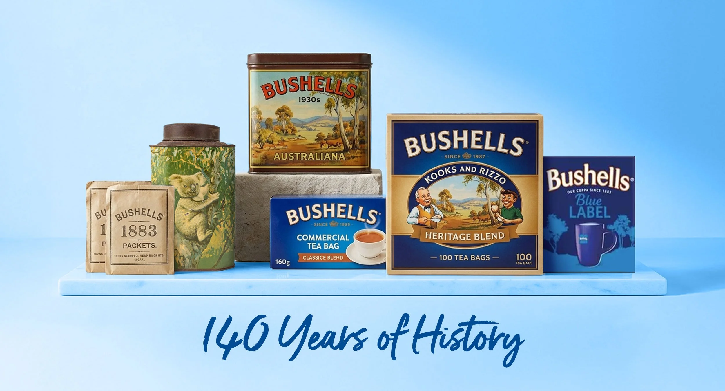
Bushells is a legacy brand in a category where trust is everything and trust takes generations to build. Founded over 140 years ago, thebrand holds a genuine and deep connection with Australian consumers.
But its packaging had not kept pace, leaving it at risk of fading from relevance as its core consumer aged and younger Australianslooked elsewhere.
BUILDING
CONNECTION
The strategic insight was clear: Bushells' problem wasn't awareness, it was emotional availability. For its loyal core, the brand meant everything. For the next generation, it barely registered.
Consumer insight revealed a powerful truth. Bushells wasn't simply a tea brand. It was a social ritual.
For generations, Bushells has been part of everyday conversations. The catch-up with a friend. The chat across the kitchen table. The break between tasks. The moment someone says, "Do you want a cuppa?"
At the heart of this story sat one of the brand's most distinctive assets: the two blue teacups. Raised in a symbolic "cheers", they represented more than tea. They represented companionship, conversation and connection, a symbol of bringing people together.
A DELICATE
BALANCING ACT
THE CREATIVE SOLUTION
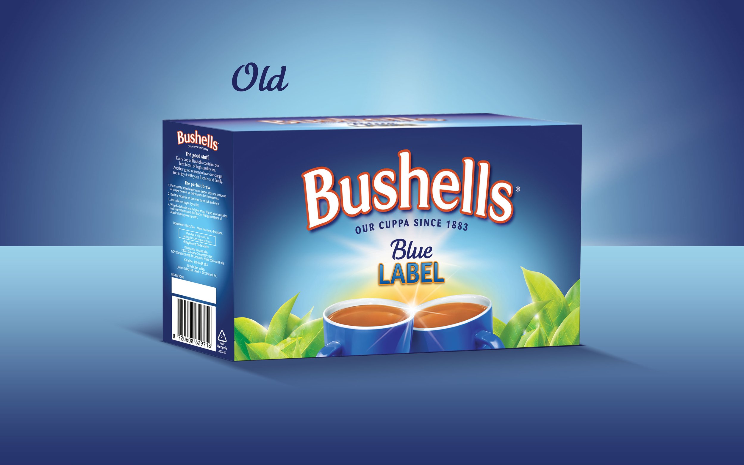
The design challenge was a delicate one. The brief permitted no more than 20% adaptation of the existing design. Every decision therefore carried weight. Too much change and loyal shopperswould lose the brand they knew, too little change and nothing would shift.
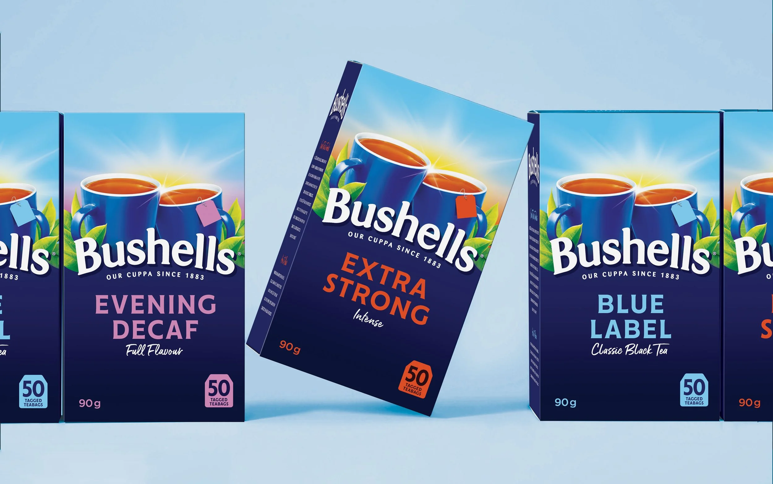
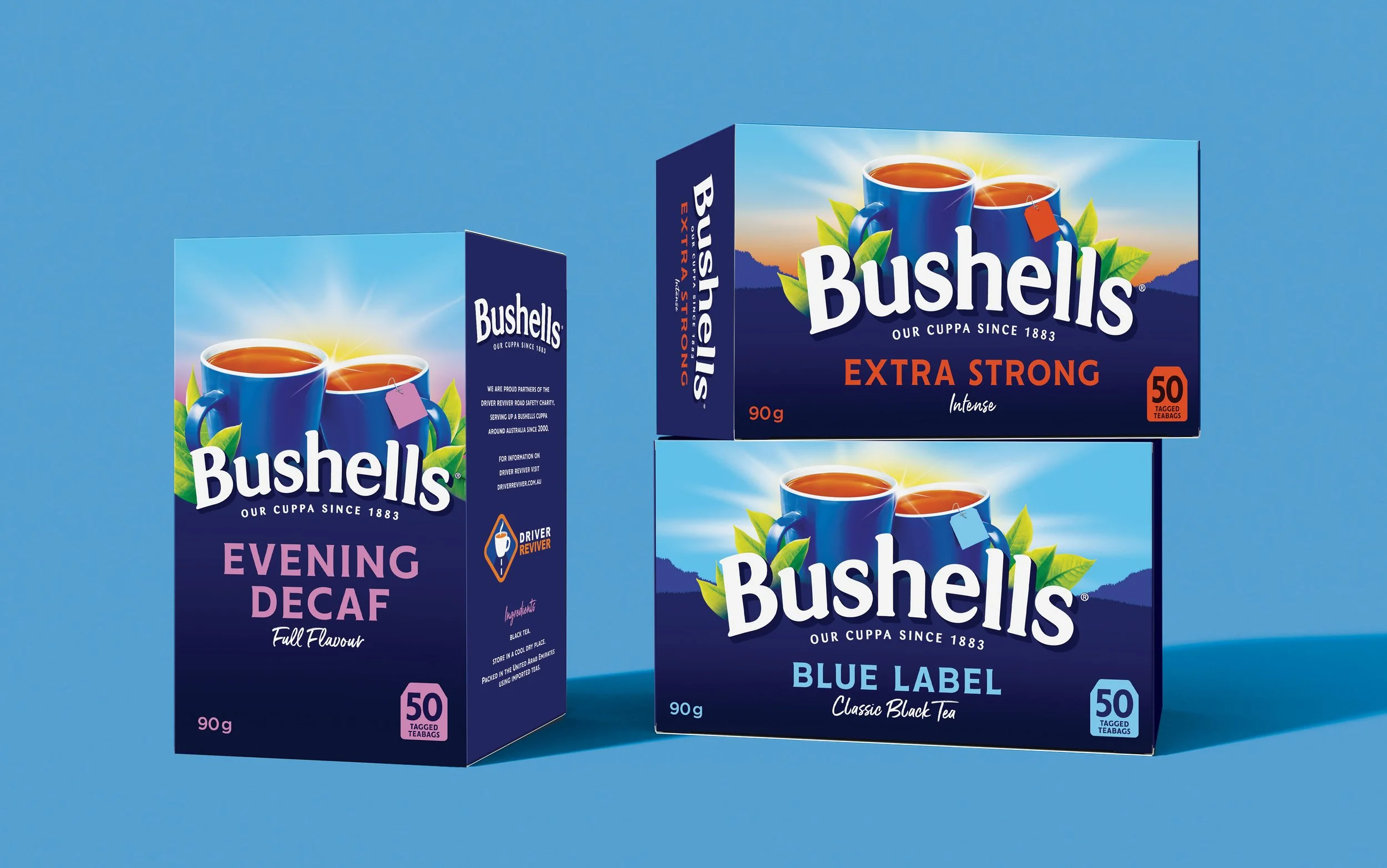
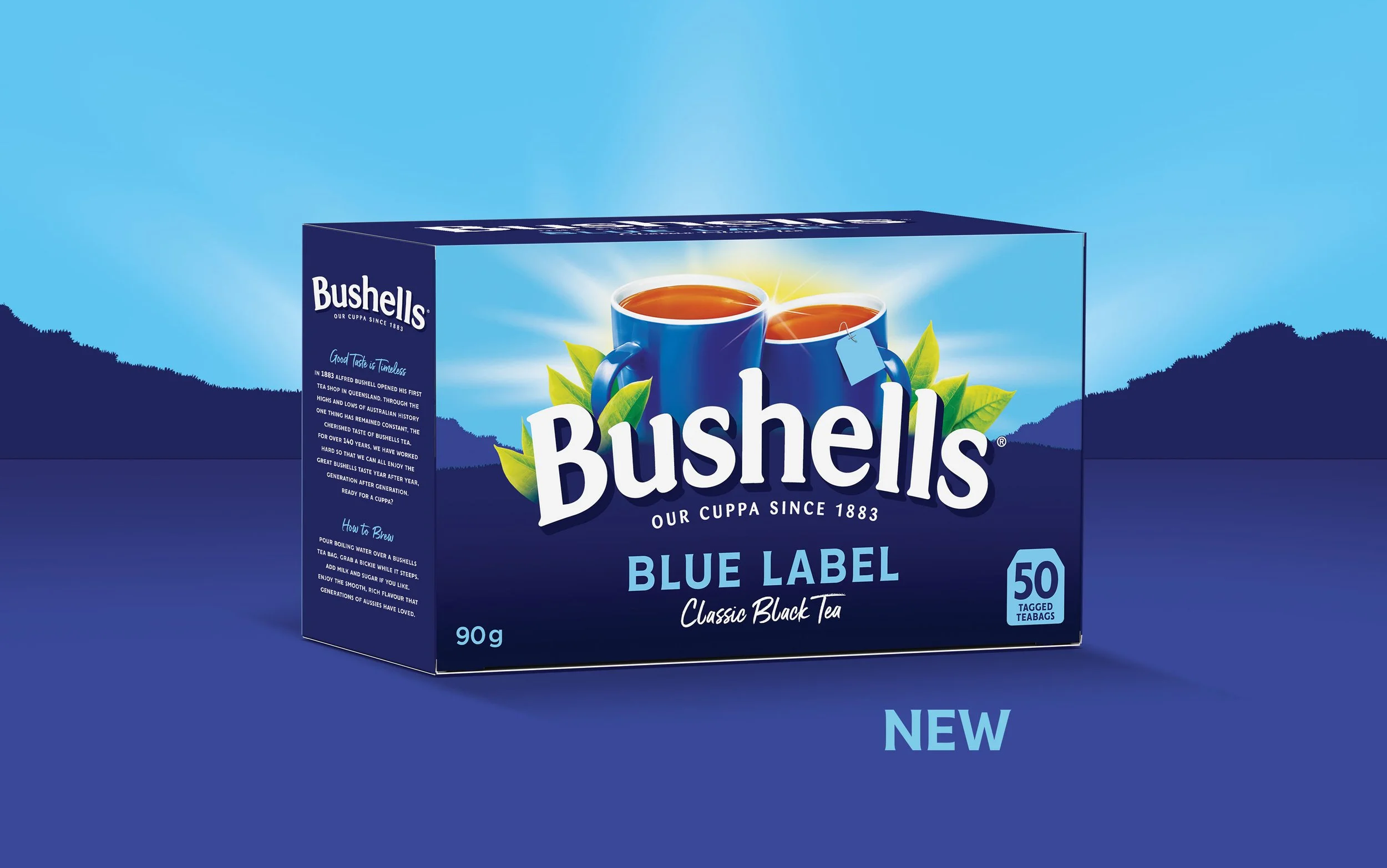
The evolution was guided by a simple principle: make Bushells feel more like itself. The brand mark was refined for greater legibility while retaining its warmth and heritage. The iconic blue skyline was refreshed to bring greater impact and shelf presence. The 'cheers' teacups were elevated as the brand's most distinctive emotional asset and connected to the word mark.
The result still feels instantly familiar, while strengthening the brand's emotional resonance and distinctiveness.
CONFIDENTLY
CRAFTED
Evolution, not revolution
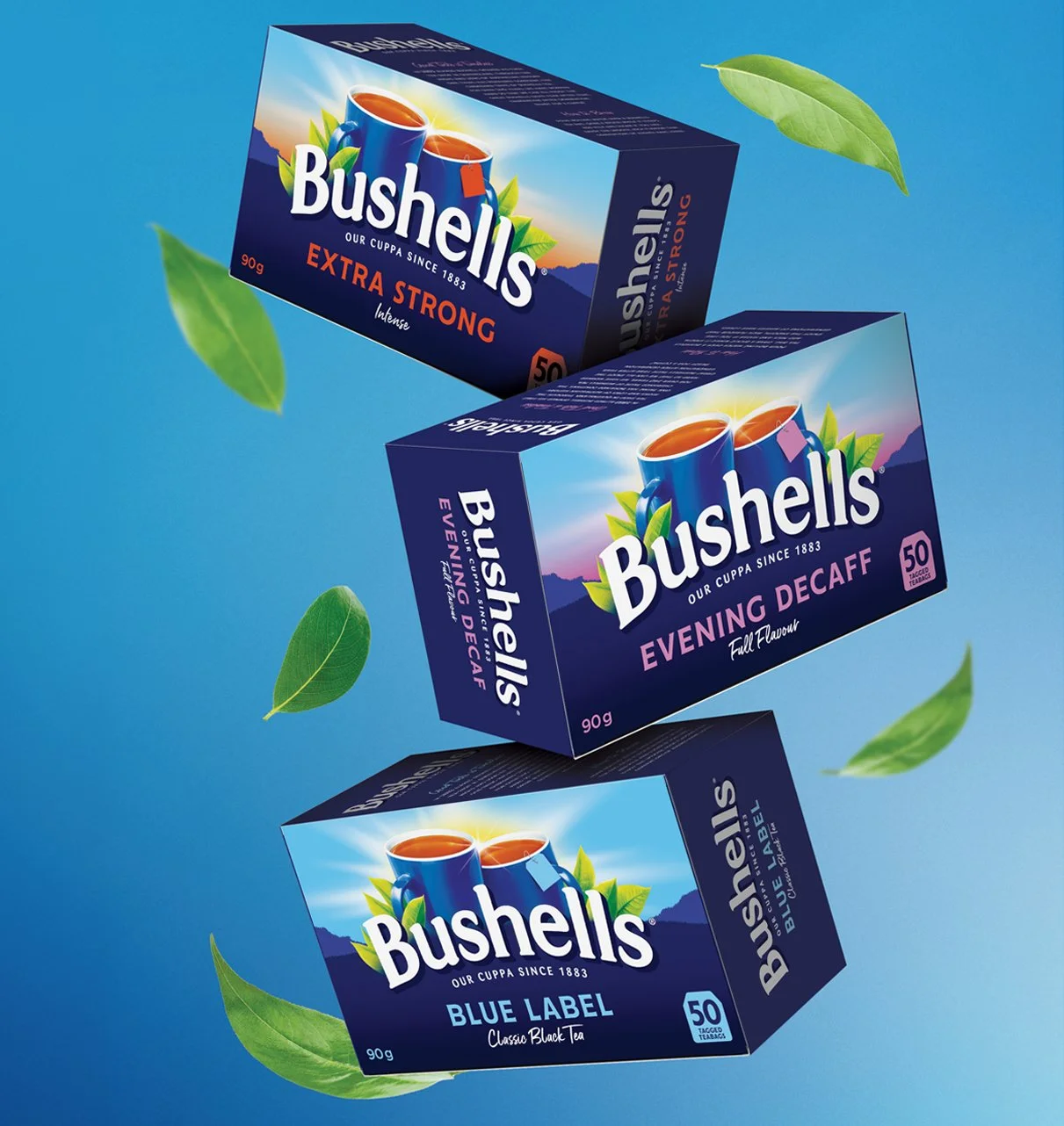
Placing the masterbrand at the centreof the design made the pack more contemporary, more distinctive, andmore iconic. The introduction of a deeper blue gave greater prominence to the masterbrand. The uncluttered pack allowed messaging to be clear and simple.
The overall goal was not to reinvent the brand. The task was to find the precise point where familiarity meets freshness, and make Bushells feel like a brand of today, without ever forgetting it's a brand of 140 years.
Designed
to Scale
MASTER OF ALL
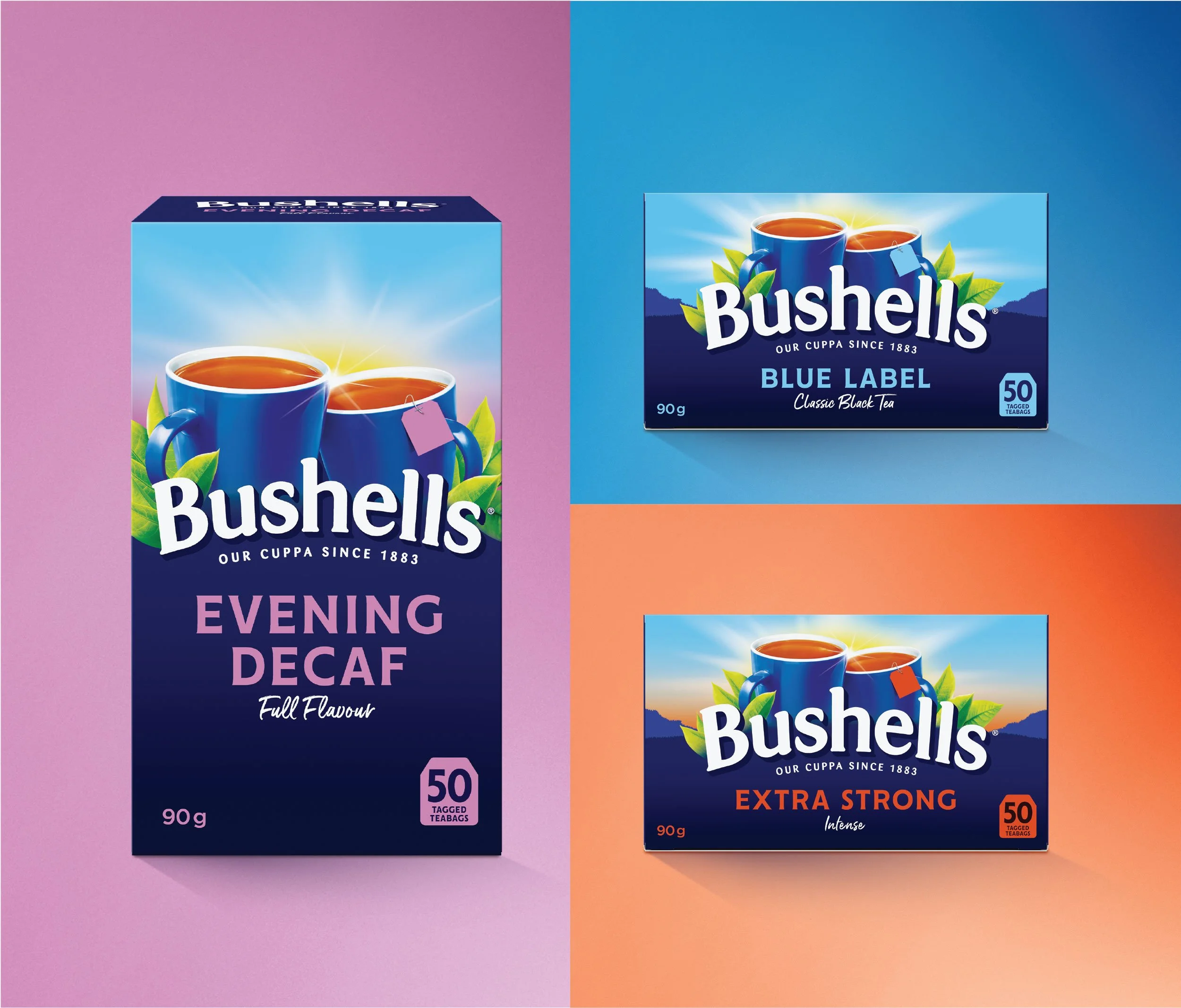
The refresh was crafted to work seamlessly across the full Bushells range, tea bags and loose leaf, across all blend variants. Familiar elements were retained but reintroduced with greater clarity and confidence, pairing the updated brand mark and elevated teacups consistently across every format.
Variant colours and descriptors were refined for cleaner range navigation, making it easier for both loyalists and new shoppers to find their blend.
The result is a cohesive design system that works harder on shelf, elevated the portfolio whist still being recognisable as Bushells, and immediately relevant to a new generation of Australians.
MAKING A
COMEBACK
CAMPAIGN CENTRE PIECE
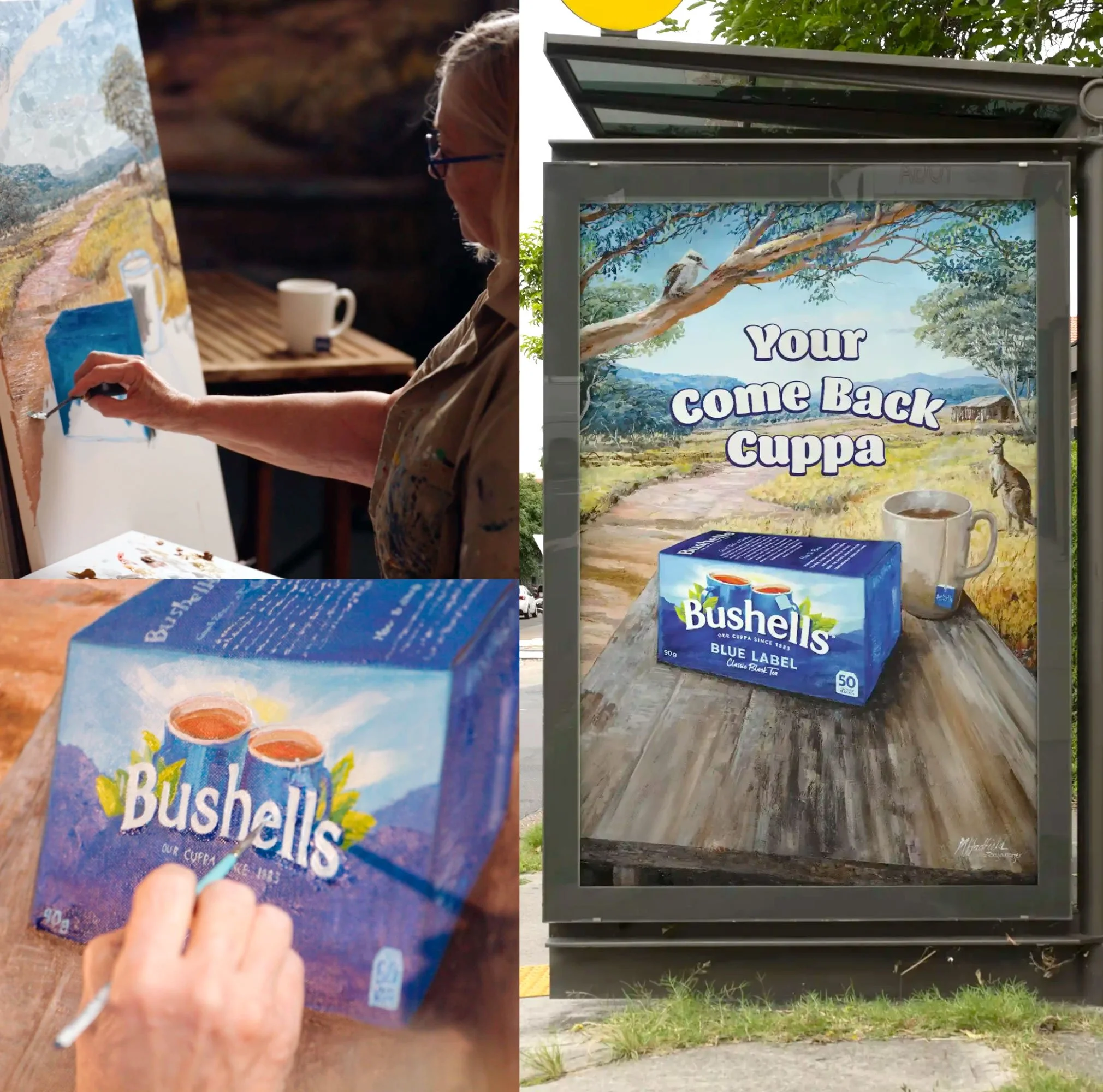
The new pack became the hero of Bushells' relaunch campaign. Designed to reintroduce Australians to the brand, the campaign brought classic 1950s Bushells tea tins to life as 'Tin-fluencers', using the new packaging as a focal point throughout.
Award-winning artist Margaret Hadfield further amplified the redesign through a hero illustration inspired by Bushells' iconic murals, ensuring the new pack featured prominently across advertising, social and brand communications.
Proof in
Every Pack
THE RESULTS
Great brand evolution doesn't shout. It shifts something subtly but unmistakably. It's the way a brand feels, the way it sits on shelf, the way it makes someone reach for it.
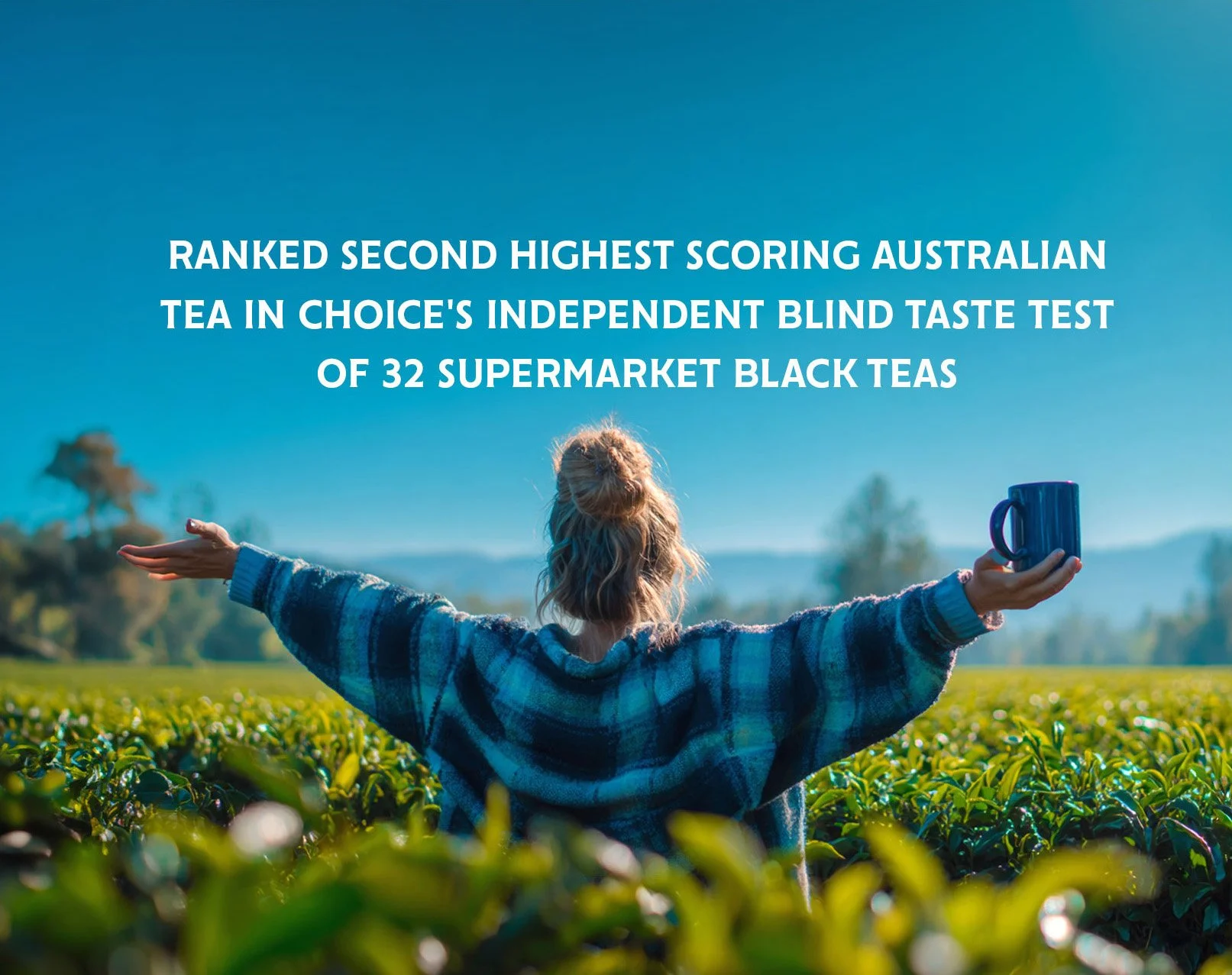
Bushells Blue Label ranks as the second highest scoring Australian tea in CHOICE's independent blind taste test of 32 supermarket black teas, described by testers as "calming, pleasant and earthy." The new packaging finally gives that quality a presence on shelf to match.
The Bushells refresh transformed existing brand assets into more powerful emotional cues, helping the brand communicate not only what it sells, but what it stands for.
Just as importantly, it demonstrates that heritage brands do not need to abandon their history to succeed. They simply need to tell it in a way that resonates today.
SHARING A KIND WORD
"Working with The Key Branding on the Bushells refresh was a great experience. From the outset, they approached the project with real strategic rigour, understanding that with a brand as iconic and loved as Bushells, the challenge wasn't just about modernising the design, but protecting the equities that generations of Australians have grown up with. They navigated that balance thoughtfully and creatively, stretching the thinking in ways that felt both bold and right for the brand. The quality of work and thinking they brought to every stage of the project was impressive, and honestly, they're just a great bunch of people to work with. We couldn't be happier with the outcome."
Sarah Shen Head of Marketing, Lipton Teas and Infusions Australia